Category

UX Research

The Bet: Build a Tool Instead of Reading 200 Tickets by Hand

By AI, Claude, Claude Code, Journey Mapping, Product Owner, Uncategorized, UX Research, Vibe Coding

The Problem

A feature faced negative feedback, but diagnosing root causes meant manually synthesizing help docs, demo transcripts, and scattered customer complaints. I could have spent weeks reading through all of it by hand — instead I made the call to vibe-code a tool that automatically generates persona-based journey maps from help center content, then integrates Zendesk and Slack to map complaints directly to journey steps. The bet: if the tool was wrong, I’d lose a week building something useless. If it worked, I’d turn months of manual audit into days.

Why It Mattered

The feedback was clear but the root causes were opaque. You could read a support ticket saying “confusing,” but which specific steps were confusing? A demo transcript mentioned complexity, but where did users get lost? Without a way to systematically map complaints to journey stages, any fix was guesswork.

Worse: manually building journey maps from scattered docs and videos would take weeks. We needed to respond to negative feedback fast — shipping improvements, not studies.

My Role

I owned the full build solo: designed the tool, vibe-coded the generator, integrated it with Zendesk and Slack, ran the analysis, and authored the handoff report. My goal was to automate the synthesis problem — turn scattered docs and demos into actionable journey maps, then wire them to live customer data so friction wasn’t abstract, it was pinned to specific steps.

The Key Insights

The problem wasn’t just scattered feedback. It was that no one had a system to connect complaints to specific steps. Manually reading docs, watching videos, and reading tickets meant months of work. But those same sources contained everything needed to generate journey maps automatically — and once you had those maps, you could overlay customer complaints and surface exactly where the friction lived.So I built a tool that auto-generates journey maps from existing content, then integrates with live customer data.

Design Decisions

1. Auto-generate from existing content, not from scratch

  • What I did: Built the generator to ingest help center docs and demo video transcripts, automatically extracting personas and journey flows. No manual mapping; let the content speak.
  • Why it mattered: We already had authoritative docs and demos. Reusing them meant fast turnaround and high fidelity — the journey map was built from what the company actually shipped, not my interpretation.
  • Tradeoff: Generator quality depends on source content quality. Garbage docs = garbage maps. But the docs were good, so this was a win.

2. Export in multiple formats for different audiences

  • What I did: Journey maps rendered as interactive HTML (editable in browser), but also exportable as PNG (for Slack, quick sharing) and PDF (for formal reports). Same data, different surfaces.
  • Why it mattered: Engineers want to click and edit (HTML). PMs want to share in Slack quickly (PNG). Leadership wants a formal artifact (PDF). One tool, multiple use cases.
  • Tradeoff: Export logic overhead — repaid by adoption. A tool no one uses because the output format is wrong is worthless.

3. Integrate Zendesk and Slack to overlay live customer data

  • What I did: The tool pulls support tickets from Zendesk and escalations from Slack, then maps them to specific journey steps. Friction isn’t abstract — it’s pinned to where it actually occurs in the flow.
  • Why it mattered: A journey map is theoretical until you validate it against real complaints. Integration meant the tool surfaced the highest-signal friction automatically.
  • Tradeoff: Integration complexity — but the payoff was precision. A complaint about “configuration step 3” could now be mapped directly to the exact UI that caused it.

4. Separate writing-fixable friction from engineering blockers upfront

  • What I did: The tool classifies each friction point by ownership: writing can fix (terminology, clarity, helper text) vs. engineering-only (routing, validation, state logic). Two lists, two different action plans.
  • Why it mattered: Prevents wasted effort. A writing pass can’t fix a broken API. An engineering sprint won’t clarify confusing copy. Separating them means both teams ship faster.
  • Tradeoff: Requires judgment calls about what’s fixable. But making those calls in the tool meant the report was already filtered by ownership, not just by severity.
  • What I killed: I considered building a confidence score per friction point, but cut it. A number that looked precise but wasn’t backed by real measurement would have been worse than no number — better to flag ambiguity honestly than fake certainty.

The Solution: Journey-Map Generator + Integrated Complaint Surfacing

The tool moved through three phases sequentially:

1. Generator Prototype (Week 1–2)

Built a simple version that ingested placeholder docs and video transcripts, auto-generating personas and journey flows in HTML. Proved the extraction and rendering logic worked before touching real content.

2. Live Generator with Export Options (Week 2–5)

Integrated real help center docs and demo video transcripts. Added export functionality: interactive HTML (browser-editable), PNG (quick sharing), PDF (formal reports). Single source, multiple outputs.

3. Zendesk + Slack Integration (Week 5–8)

Wired the tool to pull support tickets from Zendesk and escalations from Slack. The generator now maps each complaint to the specific journey step where friction occurs. Result: every customer complaint is pinned to a step, automatically classified by owner (writing vs. engineering), and ready for action.
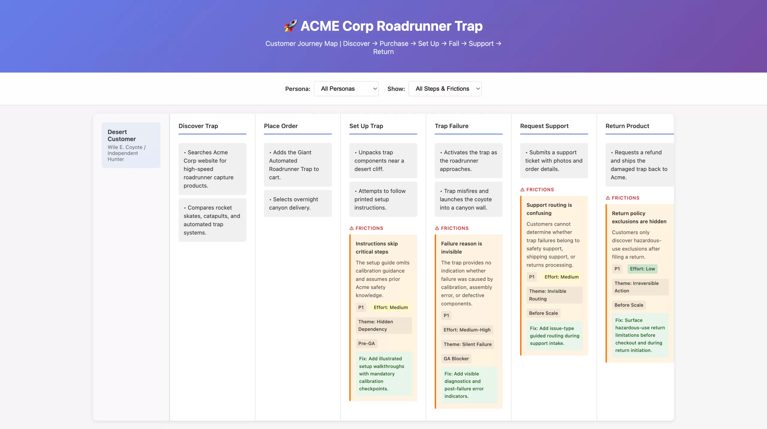
Proof of concept: A customer journey map generated from help docs and customer feedback, showing how scattered friction data (support tickets, user confusion, product failures) gets systematically pinned to specific workflow steps. Orange friction boxes surface problems at each stage with priority, effort, and recommended fixes—demonstrating the tool’s ability to turn fragmentary complaints into actionable, scoped work for both writing and engineering teams.

Outcome

Within the eight-week window, the work went from validated prototype to shipped tool to engineering handoff.

Writing-Side Fixes: Complete

Across all four admin sections:

  • Jargon removed: confusing product terminology replaced with admin-centered language (6 terms total)
  • Toggle copy converted to declarative statements with both ON/OFF states explained
  • Helper text and progressive disclosure added for error prevention and conditional relevance
  • Visual progress indicator and step descriptions built with state clarity

Engineering-Owned Issues: Scoped

As of the final report, the following are explicitly owner-assigned and tracked separately:

  • Routing logic broken (notifications never reach designated recipients, multi-stage chains skip levels) — Owner: Engineering
  • Silent auto-submit when no valid recipient exists — Owner: Engineering
  • Irreversible state transitions (misclick requires full workflow reset) — Owner: Product + Engineering
  • Multi-recipient / any-of-group support not shipped — Owner: Product
  • Required-field validation not enforced at submit time — Owner: Engineering

Usability validation and baseline metrics: Defined in the report but not yet run. The report explicitly calls for moderated usability sessions and a post-launch support-ticket baseline to measure whether configuration-related inquiries drop.
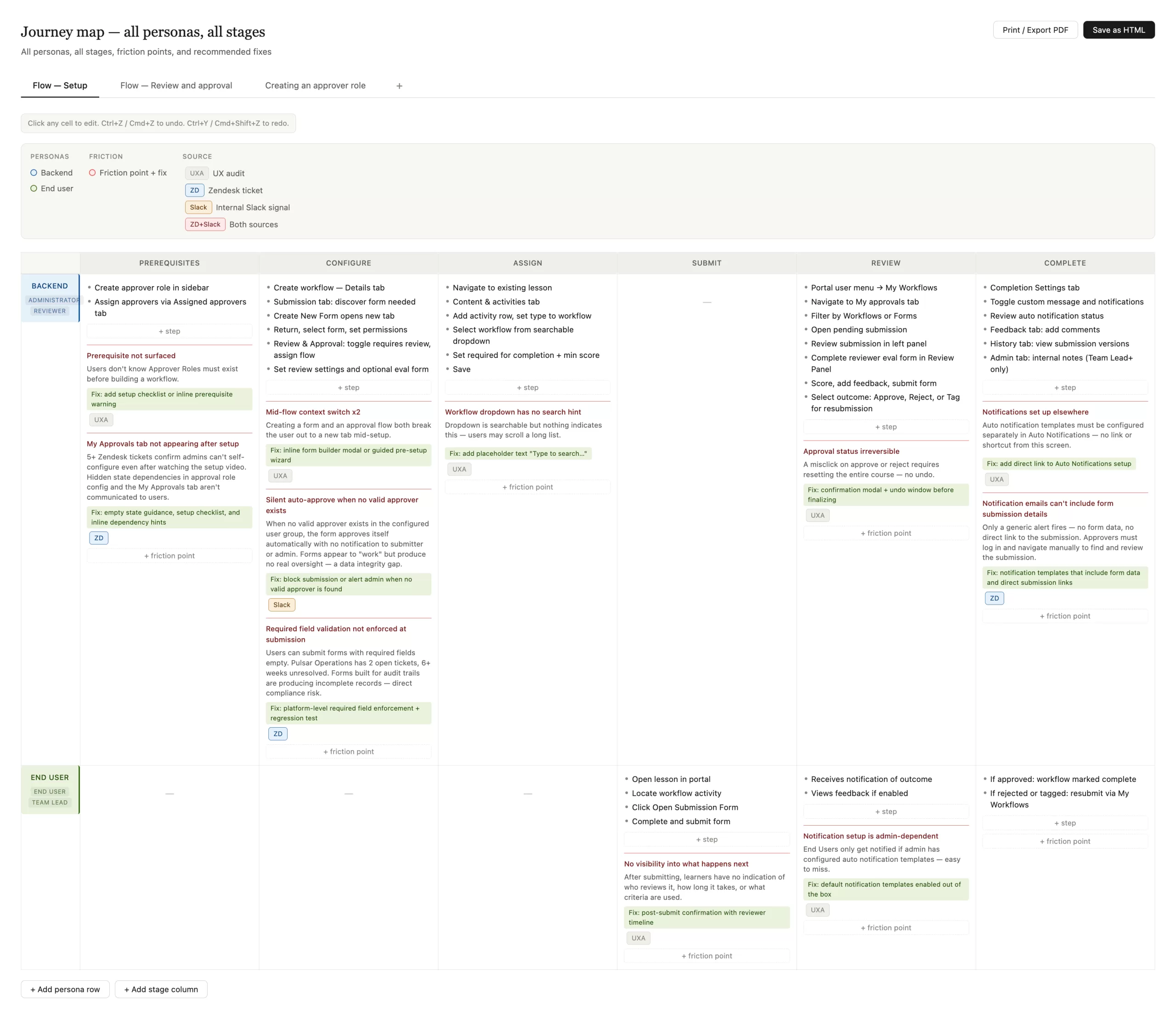
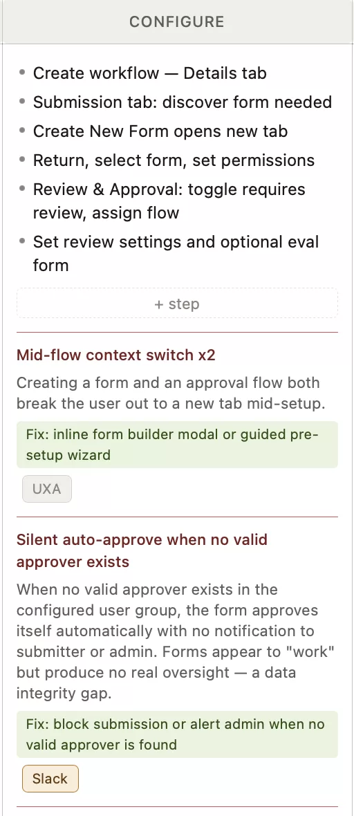
The journey-map generator in action: A fully populated journey map showing two personas (Backend Administrator, End User) across six workflow stages (Prerequisites, Configure, Assign, Submit, Review, Complete). Orange friction-point boxes surface problems at step-level precision—each with a description, priority tag (UXA = UX audit, ZD = Zendesk ticket, Slack = internal signal), effort estimate, and green-highlighted suggested fix. Multiple tabs at the top show different workflow variants (Flow — Setup, Flow — Review and approval, Creating an approver role). The map is fully editable, with buttons to add persona rows, stage columns, step items, and friction points. Print/Export PDF and Save as HTML buttons enable sharing with engineering and product teams.
Reflections

What I’d validate next
Whether owner-tagging actually changed engineering’s prioritization — did scoped issues move faster than unscoped ones used to? This is the real test of whether the taxonomy added judgment or just organization.
What risk remained
A few findings sat in genuine ambiguity between a writing fix and an infrastructure issue. I flagged the ambiguity rather than resolving it — honest but leaves a gap that requires stakeholder conversation to close.
What I’d improve with more time
Build the usability-testing and baseline-metrics step into the tool itself, so the loop from hypothesis to measured outcome doesn’t depend on a separate, currently-unscheduled effort. The report is only as good as the measurement plan that follows it.

Structural Change vs. Familiarity: A Navigation Tradeoff

By Prototyping, Transamerica, User Testing, UX Research

Solution Oveview

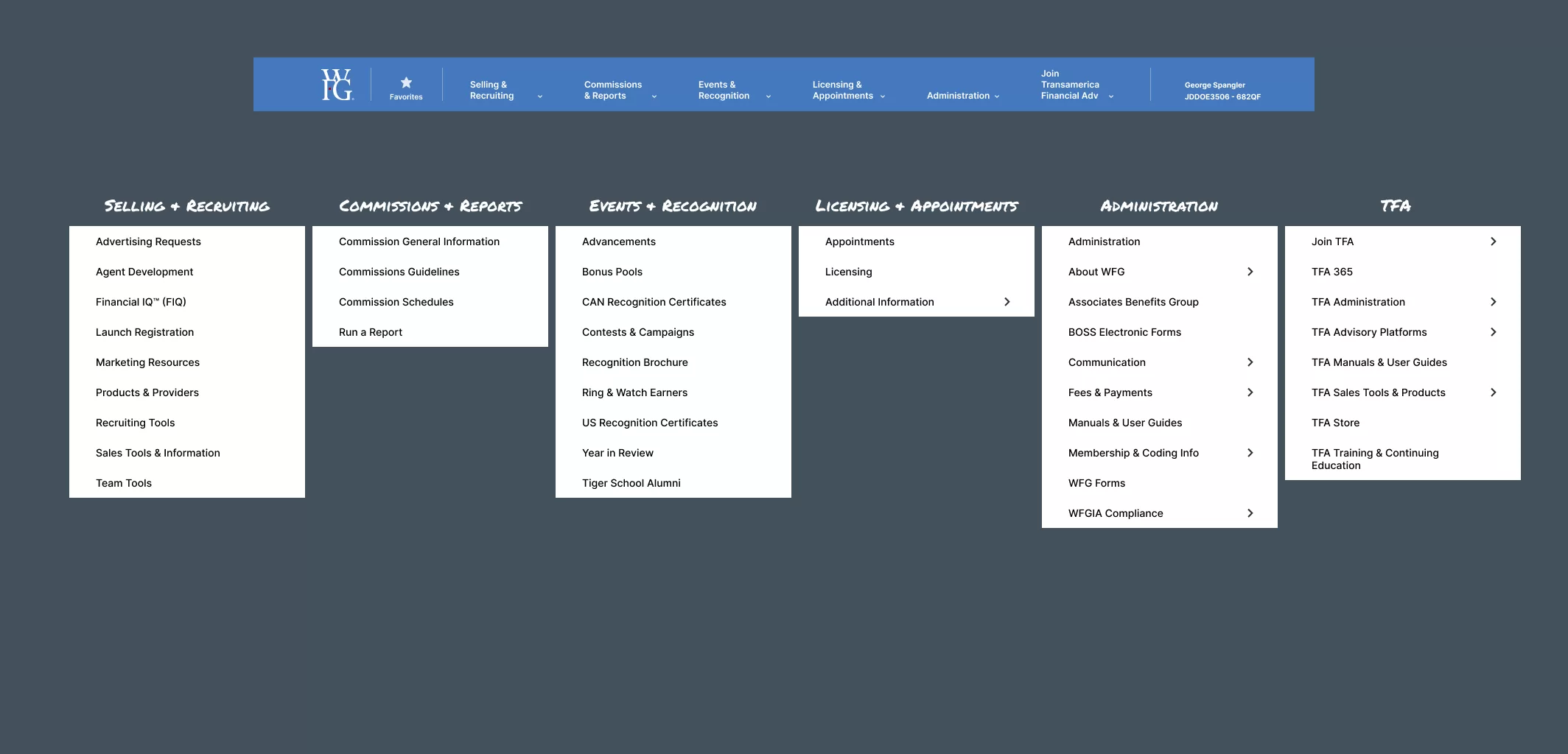
WFG agents were getting lost in their own portal — too many links, too many subcategories, no clear path to the tools they used every day. The obvious fix was trimming the menu. The harder call was deciding which version of “simpler” agents would actually trust, since the research surfaced two genuinely different concepts agents disagreed about.

Success Metrics

Although the project is still in progress and full metrics have not yet been realized, success is being guided by research-backed goals. From the outset, the team set measurable targets based on user needs and pain points identified through extensive research. These goals include:

  • A notable increase in task completion rates as a result of simplifying the navigation system.
  • Higher agent engagement driven by the reduced complexity and improved access to frequently-used tools.
  • Improved agent satisfaction, particularly regarding the reduction in clicks needed to access key resources.
  • Optimized mobile usage, with an emphasis on enhancing the experience for agents who rely on mobile devices for their daily tasks.

The Problem

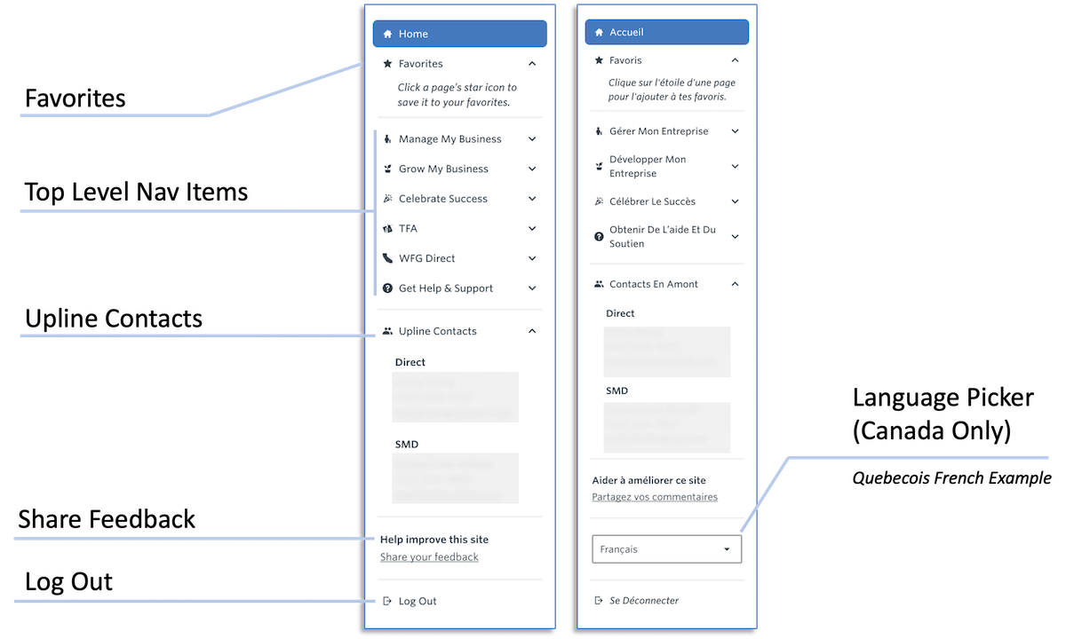
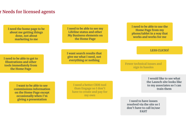
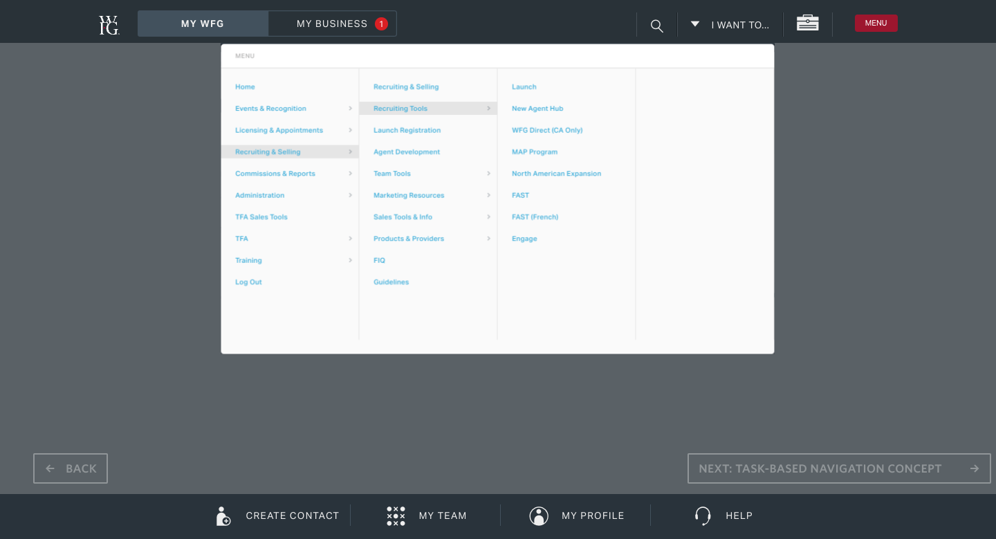
Licensed WFG agents faced significant challenges with the existing portal’s global navigation. The navigation was cluttered, with too many links and subcategories, making it difficult for agents to quickly access the essential tools they needed. Mobile users, in particular, found the portal difficult to navigate, which hindered their productivity while on the go.

Key Decisions

Simplified Navigation

  • What I did: Cut links and reorganized the remaining tools by frequency of use rather than by org chart or product category.
  • Why it mattered: Agents weren’t asking for fewer features — they were asking for fewer steps to the ones they used constantly, like Commissions and Client Management.
  • Tradeoff: Frequency-based ordering meant deprioritizing some tools entirely from the main nav. That’s a bet that the agents who need those buried tools are rare enough to accept the extra click, and it’s a bet that won’t be provable until full rollout data comes in.

Mobile Optimization

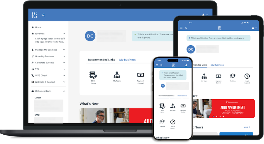
  • What I did: Treated mobile as a primary surface, not a scaled-down version of desktop.
  • Why it mattered: A large share of agents do their daily work on mobile, so a navigation fix that only worked on desktop would have solved the wrong problem for a meaningful chunk of users.
  • Tradeoff: Designing mobile-first meant some desktop conventions (denser menus, more visible categories) had to be sacrificed even for agents working at a desk — a deliberate choice to optimize for the harder context rather than split the difference.

User-Centered Design

  • What I did: Tested multiple concepts with agents instead of picking one internally and validating it after the fact.
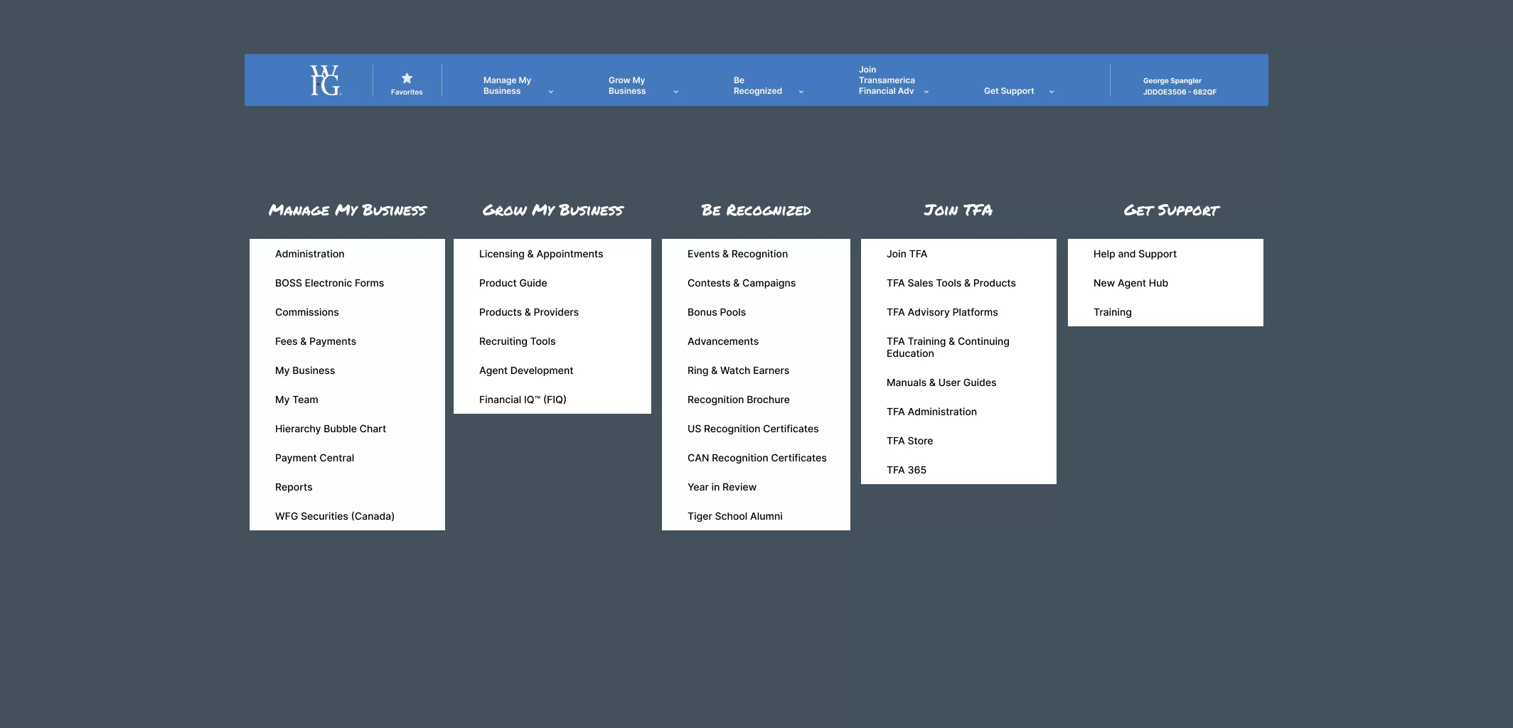
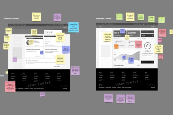
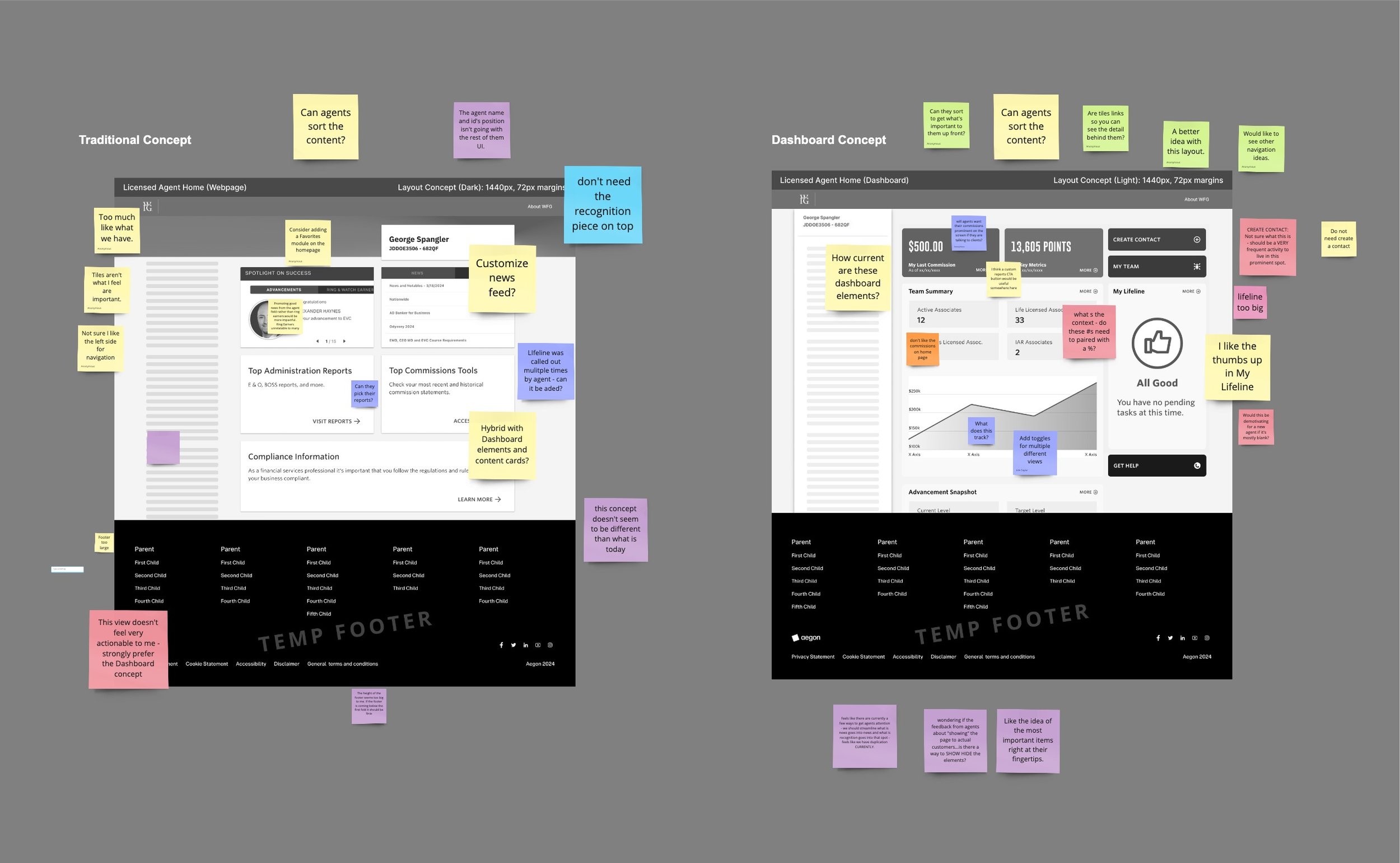
  • Why it mattered: The two concepts split opinion in a way that wouldn’t have shown up without direct feedback. One agent said a concept felt “more aligned to how people see the business,” while another pushed back simply because it was different from what they already knew — “people will have negative reaction to change.”
  • The actual decision: Between a structurally better concept that some agents resisted purely on familiarity grounds, and a more conservative option that would have under-delivered on the original problem. I went with the structural change, betting that resistance from familiarity would fade once agents adapted — which the early post-launch feedback has started to support, though it’s not yet fully validated.

Process

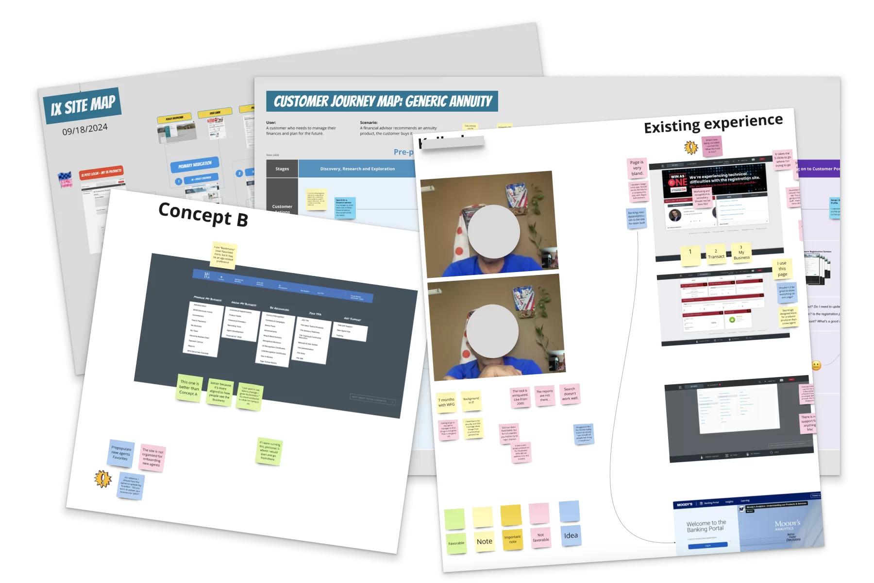
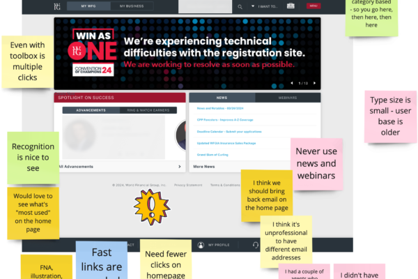
The project began with user research, where we conducted interviews and surveys with WFG agents to identify their pain points and gather insights on how the current navigation was impacting their workflow. Based on these insights, we set research-backed goals and proceeded with design and prototyping, developing several design concepts focused on simplifying navigation and improving mobile accessibility.

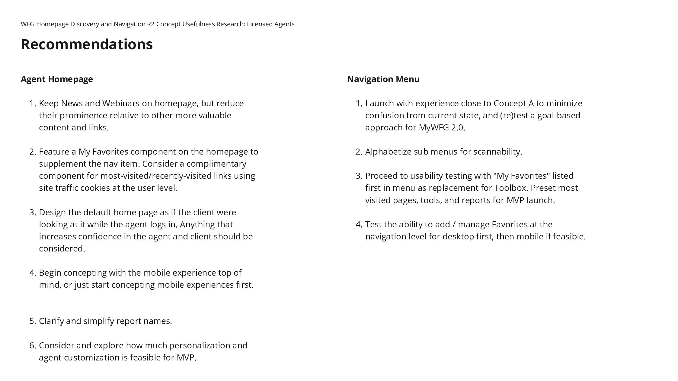
Next, we conducted usability testing with agents to evaluate the prototypes. This iterative process allowed us to refine the designs based on real-world feedback, making adjustments to enhance both desktop and mobile usability. After finalizing the design, we moved into implementation, closely monitoring user feedback to refine the system further before full rollout.

Quotes from the Research

“I feel this is friendlier. This one would be easier to teach my recruits.”

“This one is better than Concept A...better because it's more aligned to how people see the business. I just want to see how to manage / grow my business. It's more conducive to what I'm trying to do.”

"I like the other one better. People will have negative reaction to change."

Learning Valuable Insights

The clearest signal wasn’t “simplify navigation” — that part was expected. It was that a genuinely better design and a well-liked design aren’t always the same thing at first contact, and resistance to change has to be managed as part of the rollout, not treated as evidence the design was wrong. Mobile-first paid off as a hypothesis, but that’s still being confirmed against real usage data rather than proven.

Final Thoughts and Impact

This one’s still open. Full MVP testing and rollout data will tell us whether the bet on structural change over familiarity was the right one. If agent sentiment keeps trending positive as adoption grows, that’s the strongest evidence the harder call was correct — and if it doesn’t, that’s the next decision point.

One Dashboard or Two: The Personalization Bet

By Prototyping, Transamerica, User Testing, UX Research

Solution / Overview

The WFG agent portal was the kind of tool everyone tolerated but nobody liked — cluttered, generic, and built without much regard for who was actually using it. The direction was already set before I joined, but the open question on the table was personalization: build one dashboard everyone uses the same way, or build role-based views that diverge for licensed agents versus senior agents managing teams. I argued for the latter, which meant more design and system complexity in exchange for relevance per role.

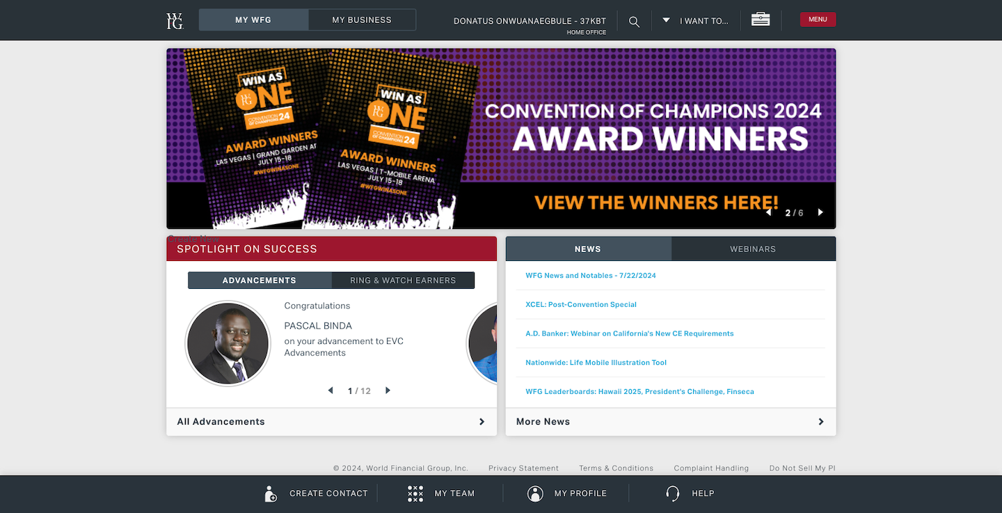
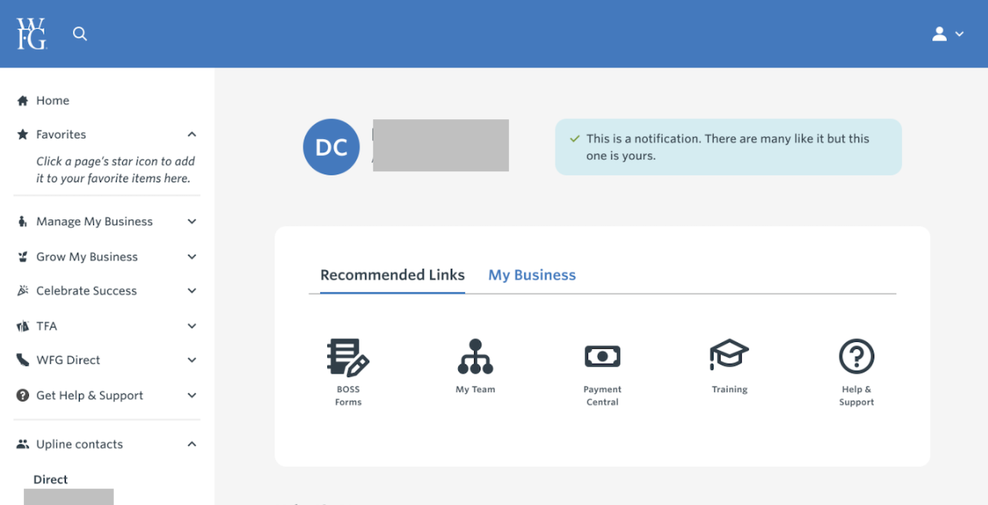
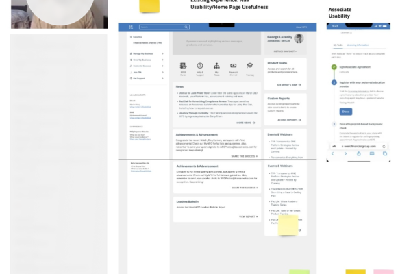
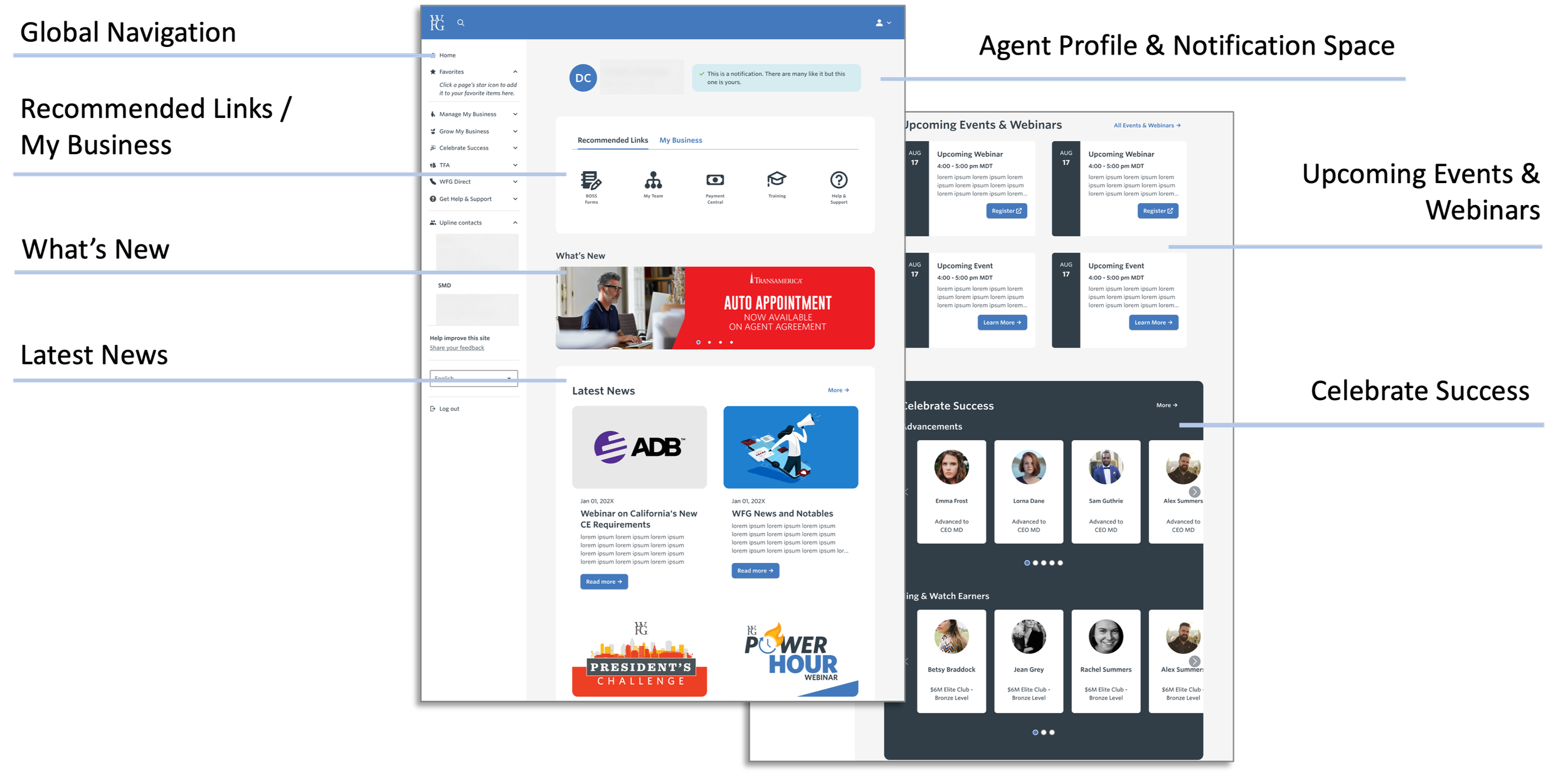
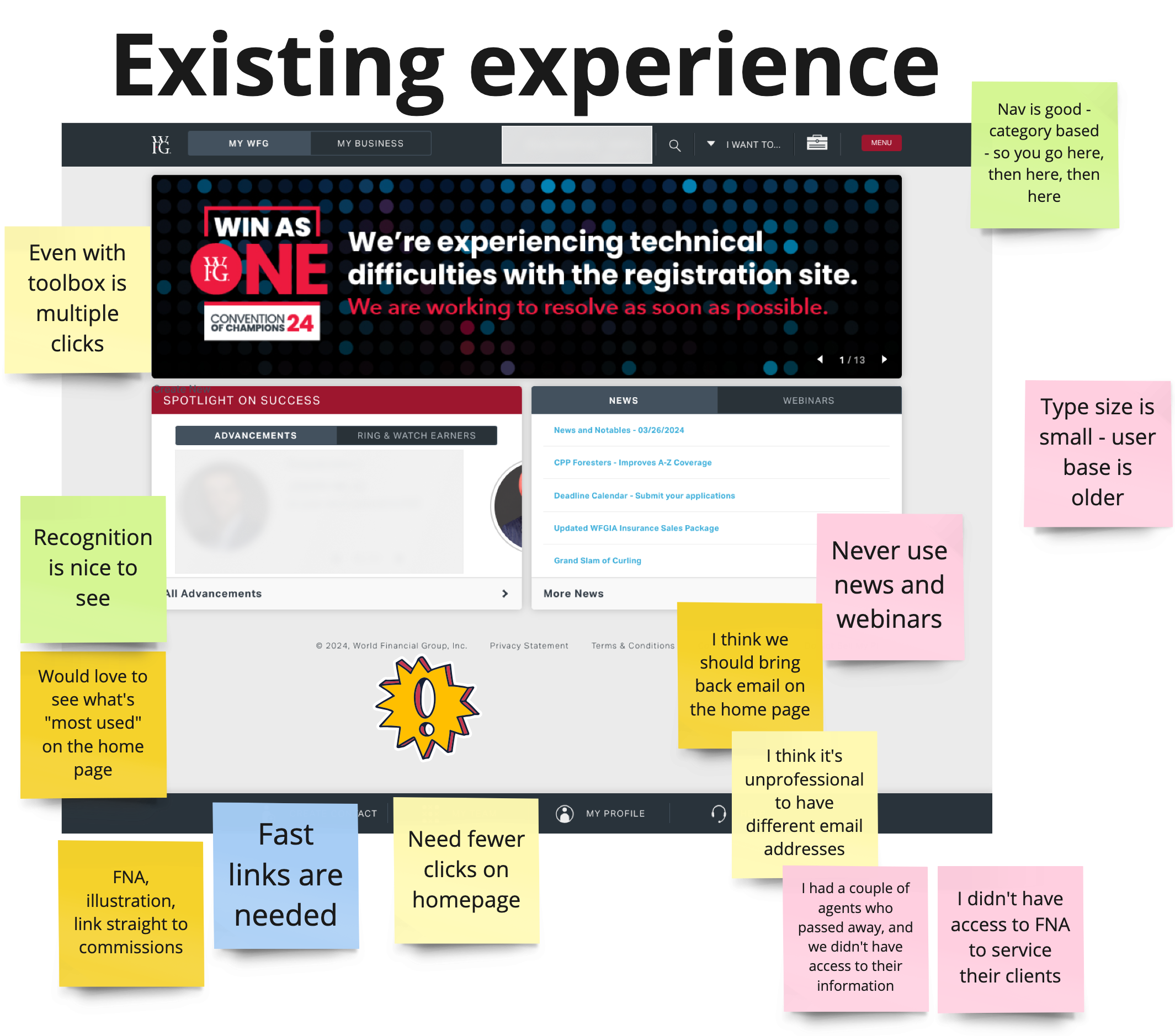
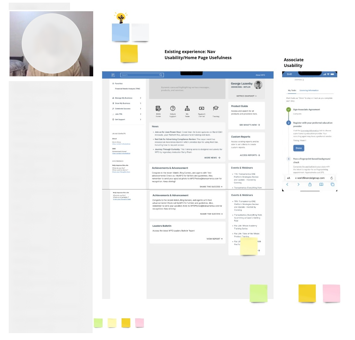
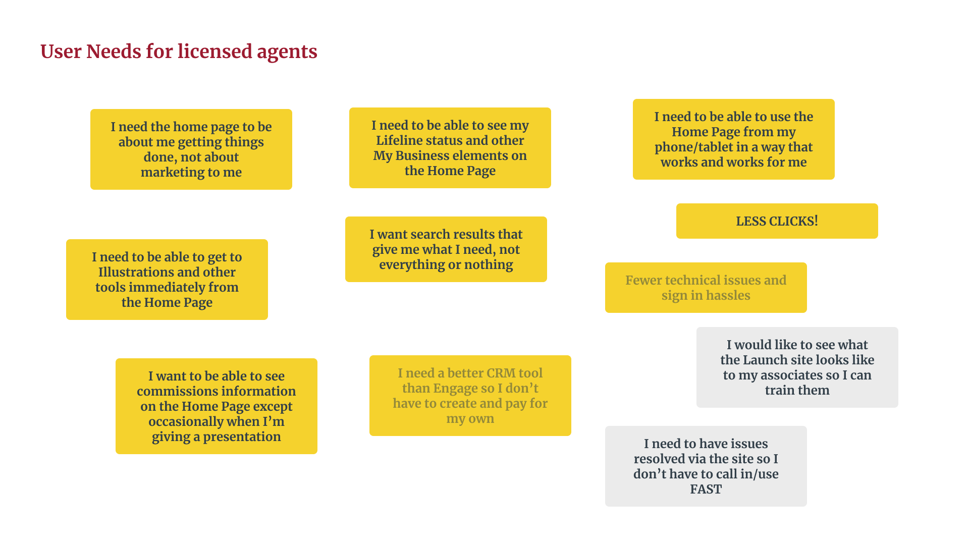
The previous design (left) was cluttered and made it difficult for advisors to access their most-used tools and information efficiently. The redesigned version (right) streamlines the experience, providing critical resources with minimal friction.

Key Features of the Solution:

  • Interactive Dashboard: A redesigned homepage with a focus on accessibility, task prioritization, and role-based customization.
  • Personalized Content: Sections that adapt to the user’s role—licensed agents gained quick access to sales tools, while senior agents could efficiently oversee team metrics.
  • Streamlined Navigation: Improved layouts and tool placements made essential resources easy to find, reducing time spent searching and increasing productivity.
  • Customized Design System: A unique design system tailored to WFG’s branding and functionality requirements ensured consistency and usability across the platform.

This comprehensive redesign reflected the unique needs of WFG’s agents while fostering productivity, user satisfaction, and engagement. By listening to users and iterating on feedback, the solution transformed frustration into empowerment, helping agents achieve their goals with ease and confidence in a SAFe Agile environment.

Collaborating on a Research-Driven Approach

While the project’s direction was set before I joined, our team identified opportunities to conduct key research, including user interviews and usability tests, to refine the design. Working together, we ensured the final solution aligned with user needs, demonstrating my ability to contribute to impactful, user-centered design in a collaborative environment.

Based on insights gathered during research and testing, the following metrics were established as key indicators of the redesign’s potential success. These targets represent the outcomes expected to address the challenges identified during the project:

  • Task Completion Rate: Aiming for a 95% task completion rate to ensure users can easily navigate the portal and complete key tasks with minimal friction.
  • User Engagement: Setting a goal for a 20% increase in weekly logins, reflecting improved usability and user motivation to interact with the portal regularly.
  • User Satisfaction: Targeting a 75% satisfaction rate, indicating a significant positive response to the tailored, intuitive design.
  • Net Promoter Score (NPS): Aspiring to achieve an NPS of 40+, signifying users’ likelihood to recommend the portal to colleagues due to its effectiveness and personalization.

These metrics were not measured yet but were defined as aspirational goals, informed by user research, competitive analysis, and usability testing. They serve as benchmarks for the ongoing project and guide the iterative improvements to ensure the final solution delivers maximum value to users.

Problem

The WFG agent portal was unintuitive and inefficient, with essential tools hard to find and no personalization, leading to frustration, reduced productivity, and low engagement.

3 Key Decisions

    1. What I did: Joined a project whose direction was already set, and pushed to add user interviews and usability testing rather than design against the existing brief alone.
    2. Why it mattered: The original scope didn’t include direct user input — adding it meant the redesign was grounded in actual agent pain points instead of assumptions carried over from the prior portal.
    3. Tradeoff: Adding research after direction was set cost time the team didn’t originally budget for, but skipping it risked shipping a redesign that solved the wrong friction.
  1. Develop a Tailored Design System: Created a consistent, scalable system aligned with WFG’s needs.
    1. What I did: Built a custom design system for WFG instead of reusing a generic or off-the-shelf component set.
    2. Why it mattered: WFG’s branding and functional requirements didn’t map cleanly onto existing patterns, so a tailored system kept the experience consistent without forcing the design into a mismatched mold.
    3. Tradeoff: A custom system takes longer to build and maintain than adopting an existing one — that cost was accepted because consistency across a high-friction tool mattered more than speed to ship.
  2. Prioritize Personalization: Designed role-based dashboards for better task prioritization and ease of access.
    1. What I did: Designed role-based dashboards so licensed agents and senior agents saw different priority content, rather than one dashboard for everyone.
    2. Why it mattered: Licensed agents needed fast access to sales tools; senior agents needed team-metric visibility. A single shared view would have buried one group’s priorities to surface the other’s.
    3. Tradeoff: Role-based design multiplies the surface area you have to build, test, and maintain. It’s a bet that relevance per role outweighs the simplicity of one unified experience — a bet that hasn’t been validated yet, since engagement and satisfaction metrics are aspirational targets, not measured results.

Process

  1. Research: Gathered insights from user interviews, surveys, and usability tests.
  2. Prototyping: Created and tested wireframes and high-fidelity prototypes.
  3. Iteration: Refined designs based on feedback to improve usability and functionality.
  4. Customization: Built an ad-hoc, unique design system to ensure consistency and scalability.

Learnings

The real tension on this project wasn’t whether to do user research — that part was straightforward once added. It was whether personalization was worth the system complexity it demanded. Committing to role-based dashboards before having usage data to back it up was the riskier call, and it’s still an open question whether it pays off against a simpler shared-view alternative.

Final Thoughts

The targets — task completion, login frequency, NPS — are goals the team set going in, not results yet realized. I’d treat that honestly here: the personalization bet is the thing worth watching once real usage data comes in, since that’s the call most likely to be wrong in either direction.