Solution Oveview
WFG agents were getting lost in their own portal — too many links, too many subcategories, no clear path to the tools they used every day. The obvious fix was trimming the menu. The harder call was deciding which version of “simpler” agents would actually trust, since the research surfaced two genuinely different concepts agents disagreed about.
Success Metrics
Although the project is still in progress and full metrics have not yet been realized, success is being guided by research-backed goals. From the outset, the team set measurable targets based on user needs and pain points identified through extensive research. These goals include:
- A notable increase in task completion rates as a result of simplifying the navigation system.
- Higher agent engagement driven by the reduced complexity and improved access to frequently-used tools.
- Improved agent satisfaction, particularly regarding the reduction in clicks needed to access key resources.
- Optimized mobile usage, with an emphasis on enhancing the experience for agents who rely on mobile devices for their daily tasks.
The Problem
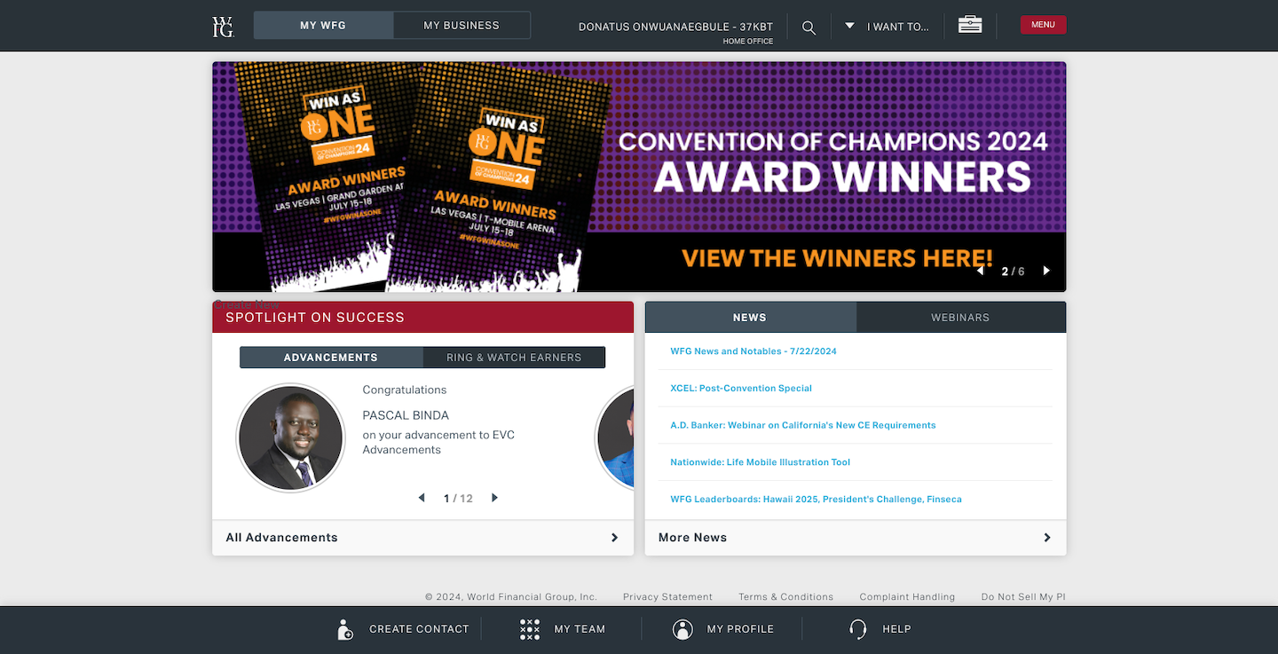
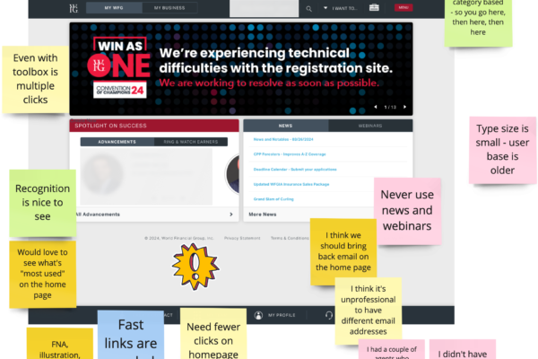
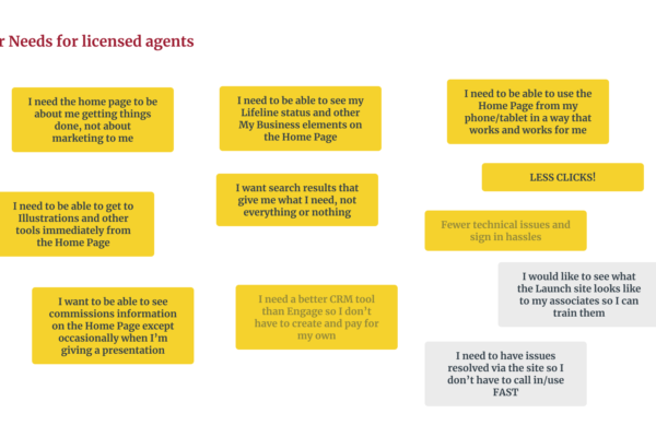
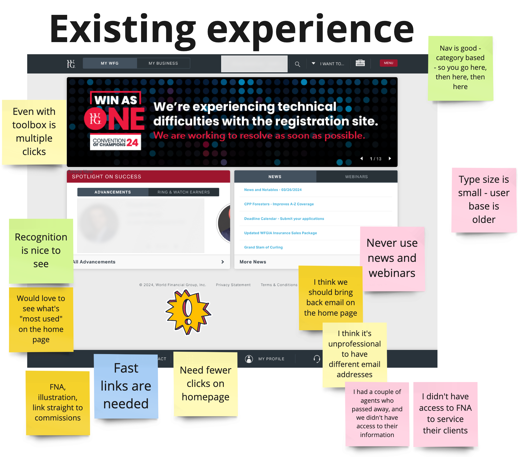
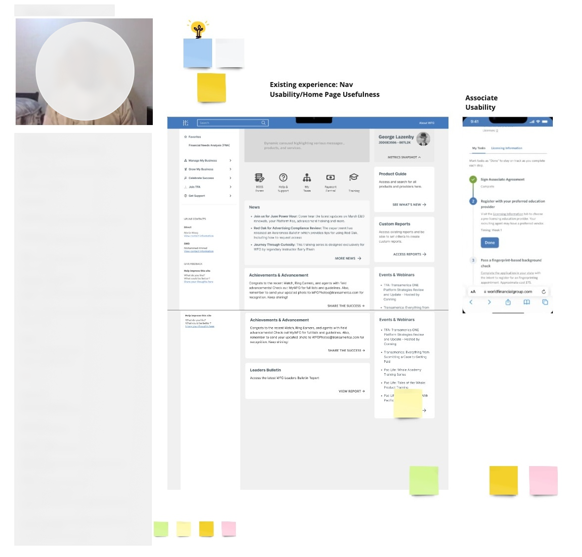
Licensed WFG agents faced significant challenges with the existing portal’s global navigation. The navigation was cluttered, with too many links and subcategories, making it difficult for agents to quickly access the essential tools they needed. Mobile users, in particular, found the portal difficult to navigate, which hindered their productivity while on the go.
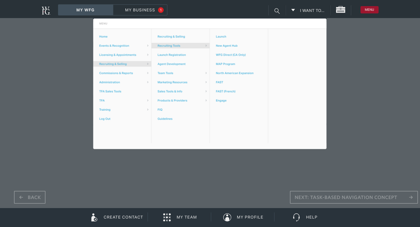
Problem Statement:
“Licensed WFG agents face difficulty accessing key tools quickly due to a cluttered and inefficient global navigation system, leading to reduced productivity and frustration, particularly on mobile devices.”
Key Decisions
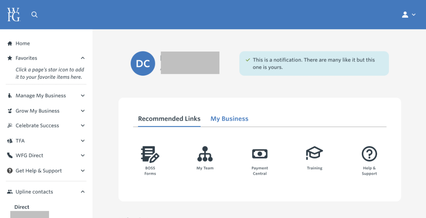
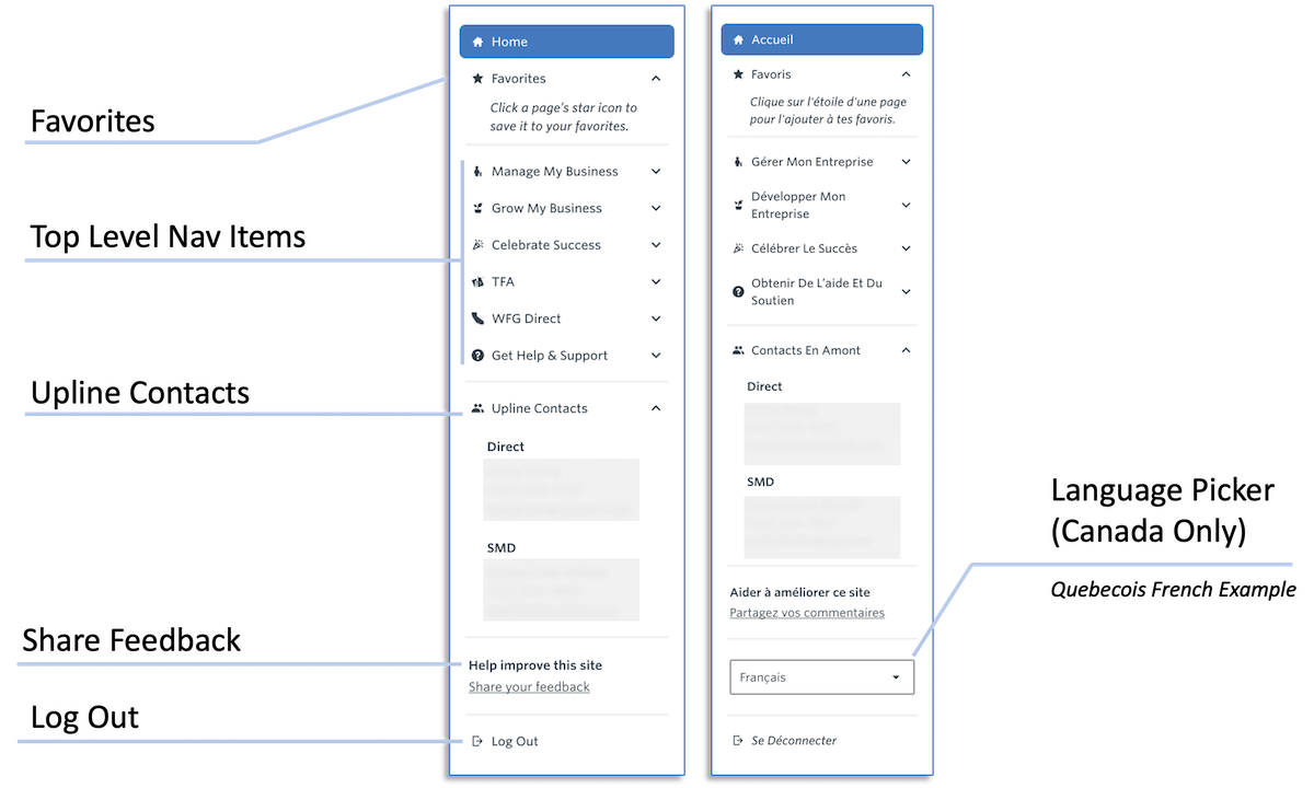
Simplified Navigation
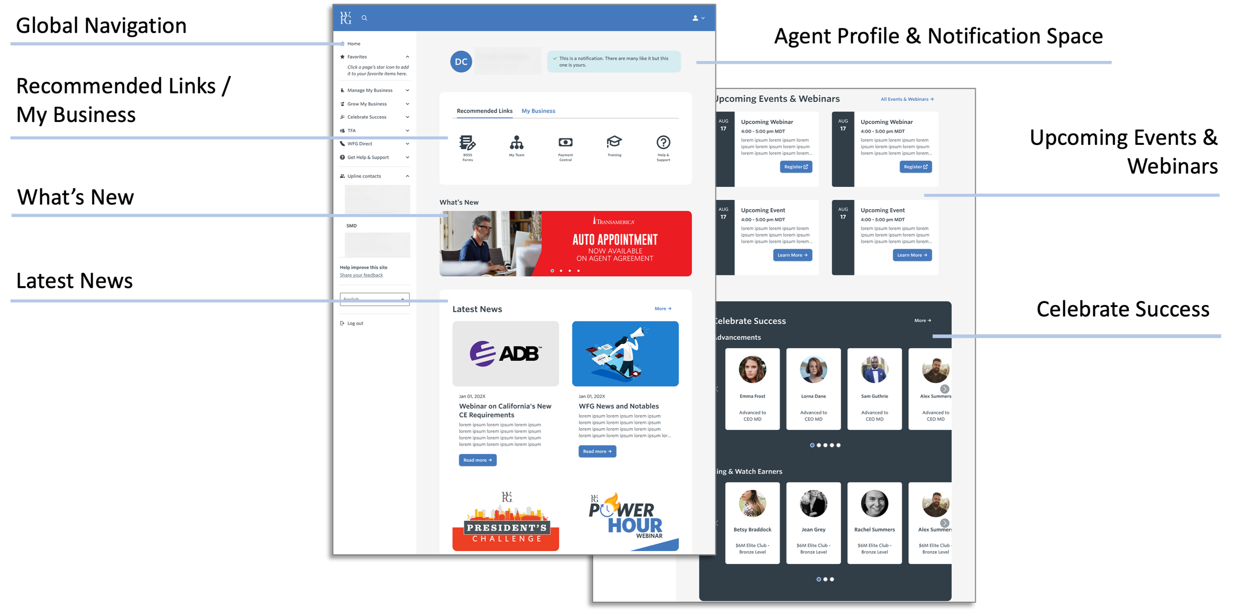
- What I did: Cut links and reorganized the remaining tools by frequency of use rather than by org chart or product category.
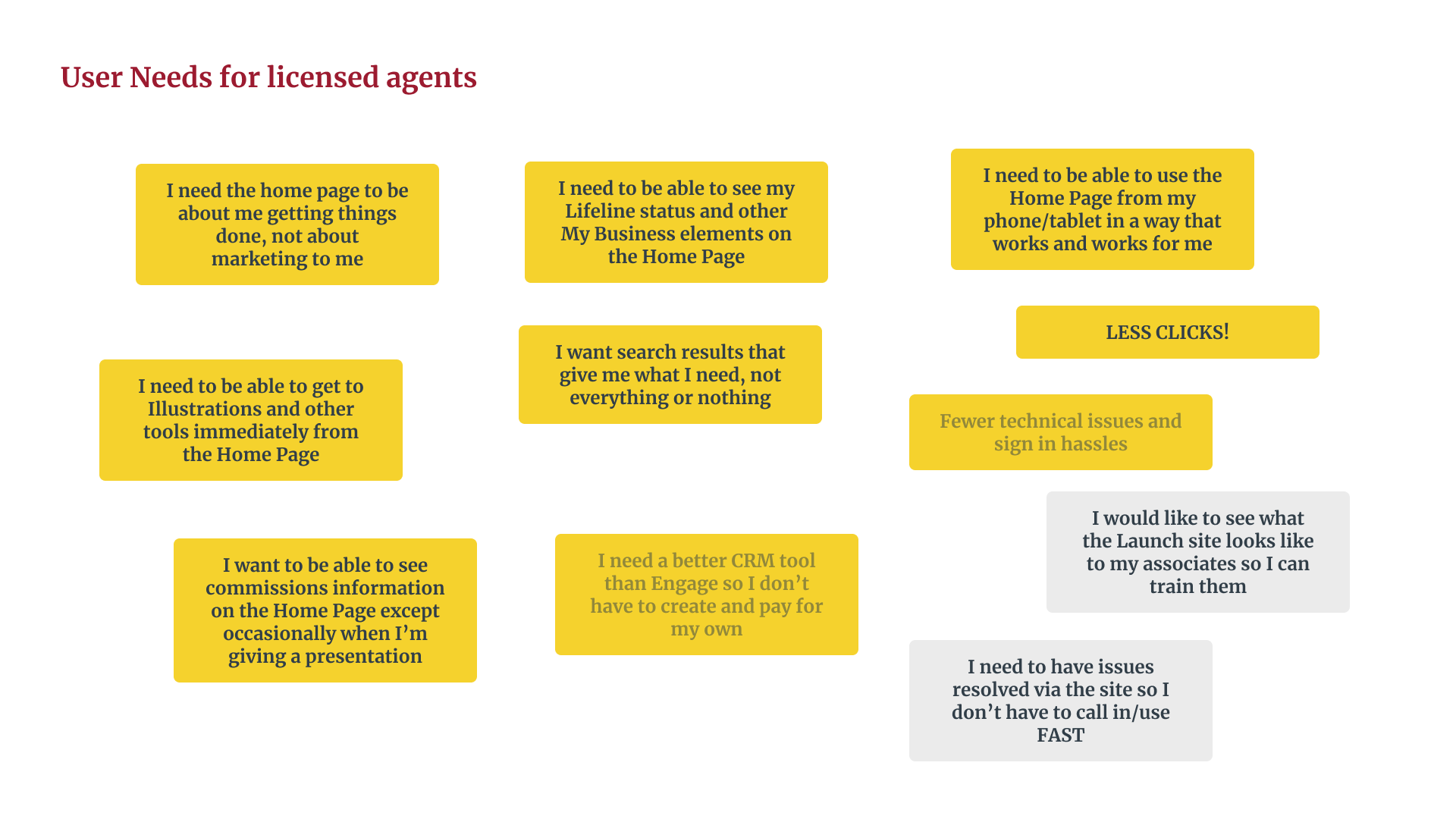
- Why it mattered: Agents weren’t asking for fewer features — they were asking for fewer steps to the ones they used constantly, like Commissions and Client Management.
- Tradeoff: Frequency-based ordering meant deprioritizing some tools entirely from the main nav. That’s a bet that the agents who need those buried tools are rare enough to accept the extra click, and it’s a bet that won’t be provable until full rollout data comes in.
Mobile Optimization
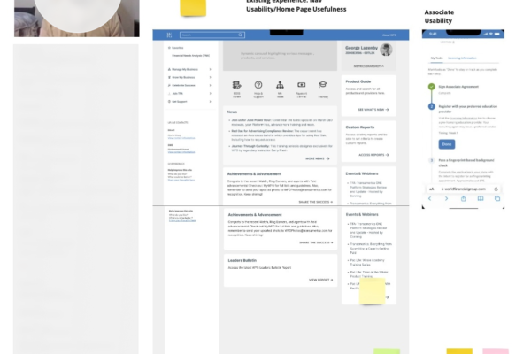
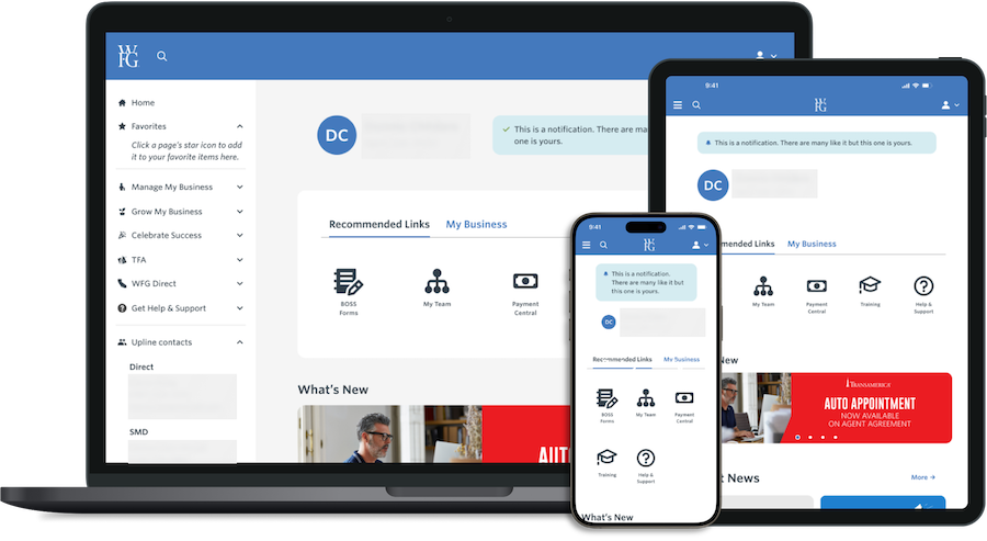
- What I did: Treated mobile as a primary surface, not a scaled-down version of desktop.
- Why it mattered: A large share of agents do their daily work on mobile, so a navigation fix that only worked on desktop would have solved the wrong problem for a meaningful chunk of users.
- Tradeoff: Designing mobile-first meant some desktop conventions (denser menus, more visible categories) had to be sacrificed even for agents working at a desk — a deliberate choice to optimize for the harder context rather than split the difference.
User-Centered Design
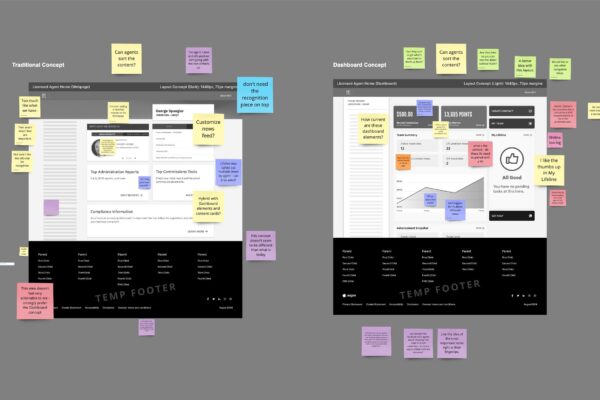
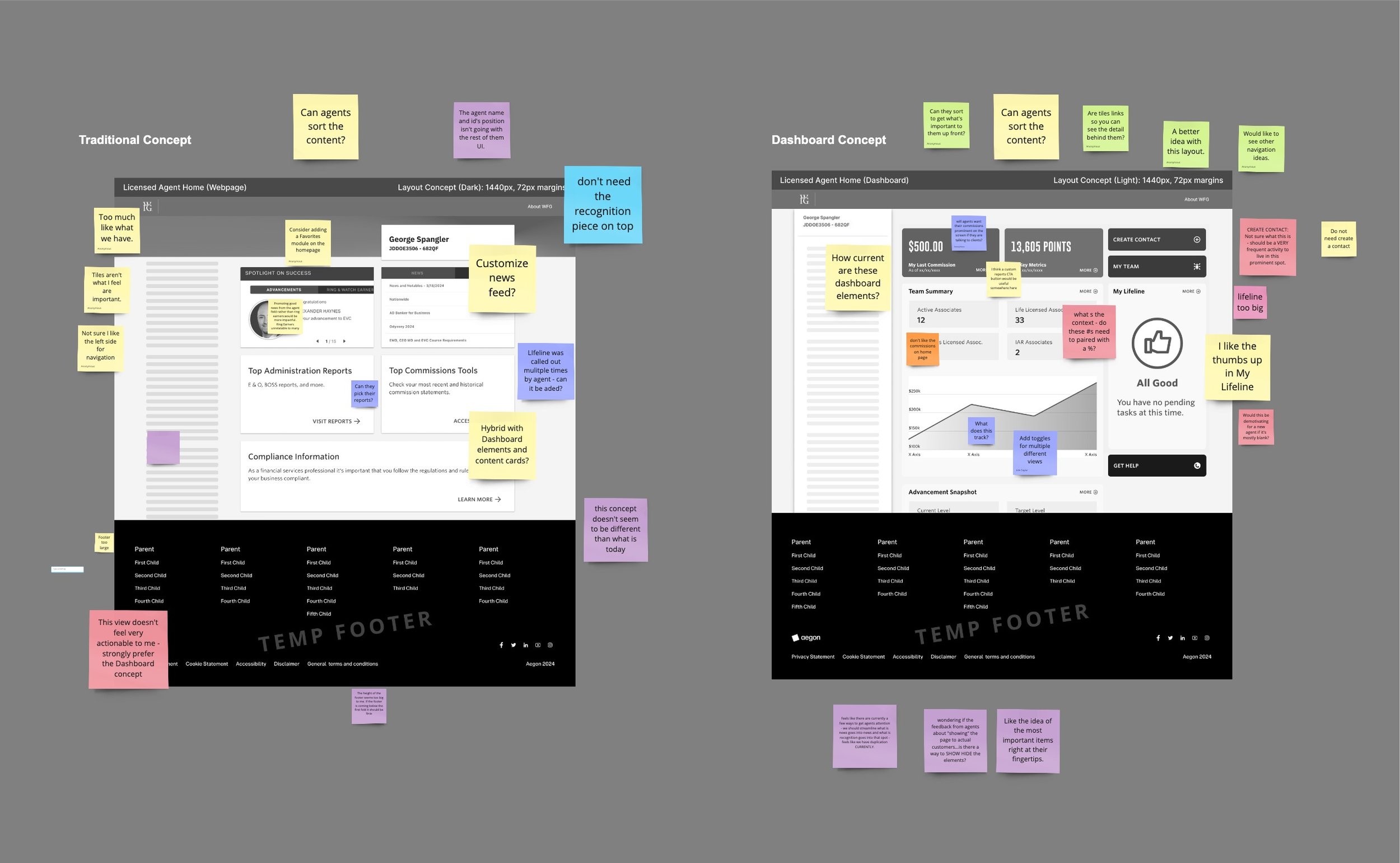
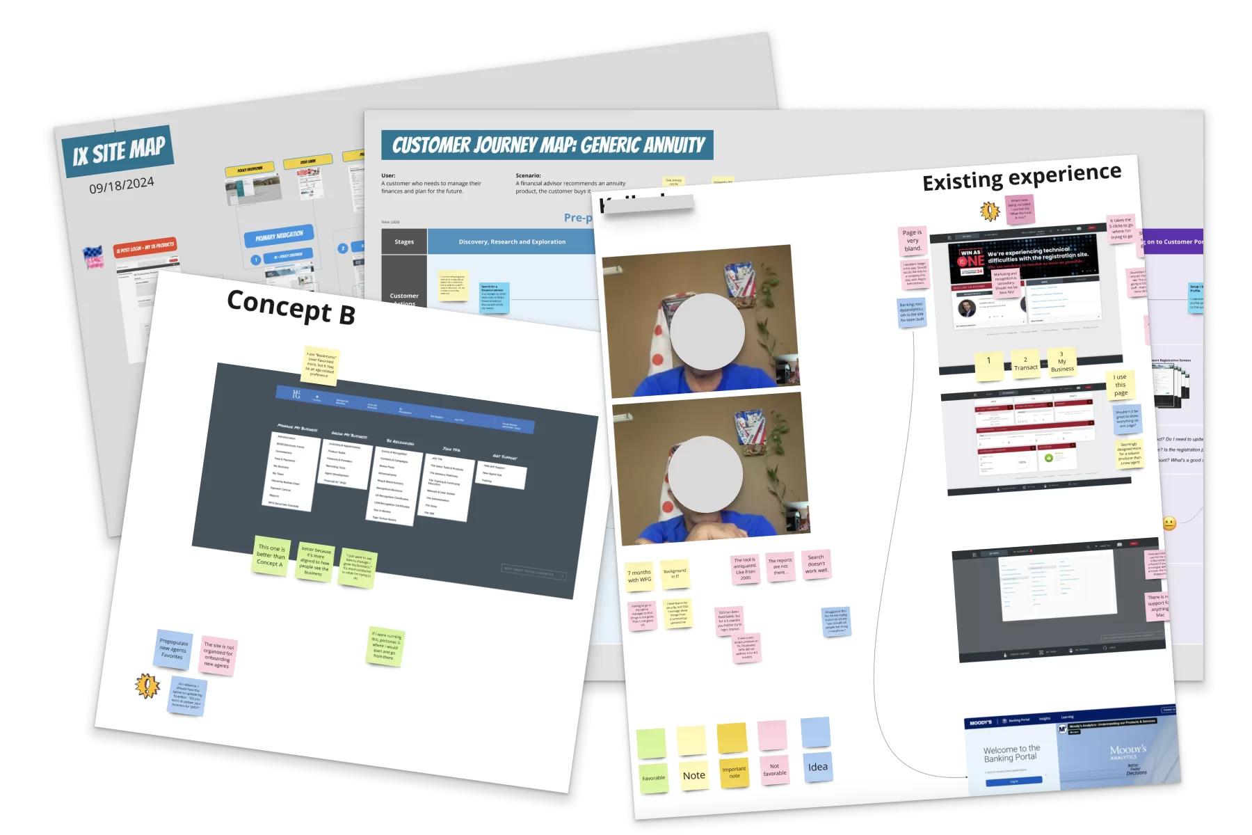
- What I did: Tested multiple concepts with agents instead of picking one internally and validating it after the fact.
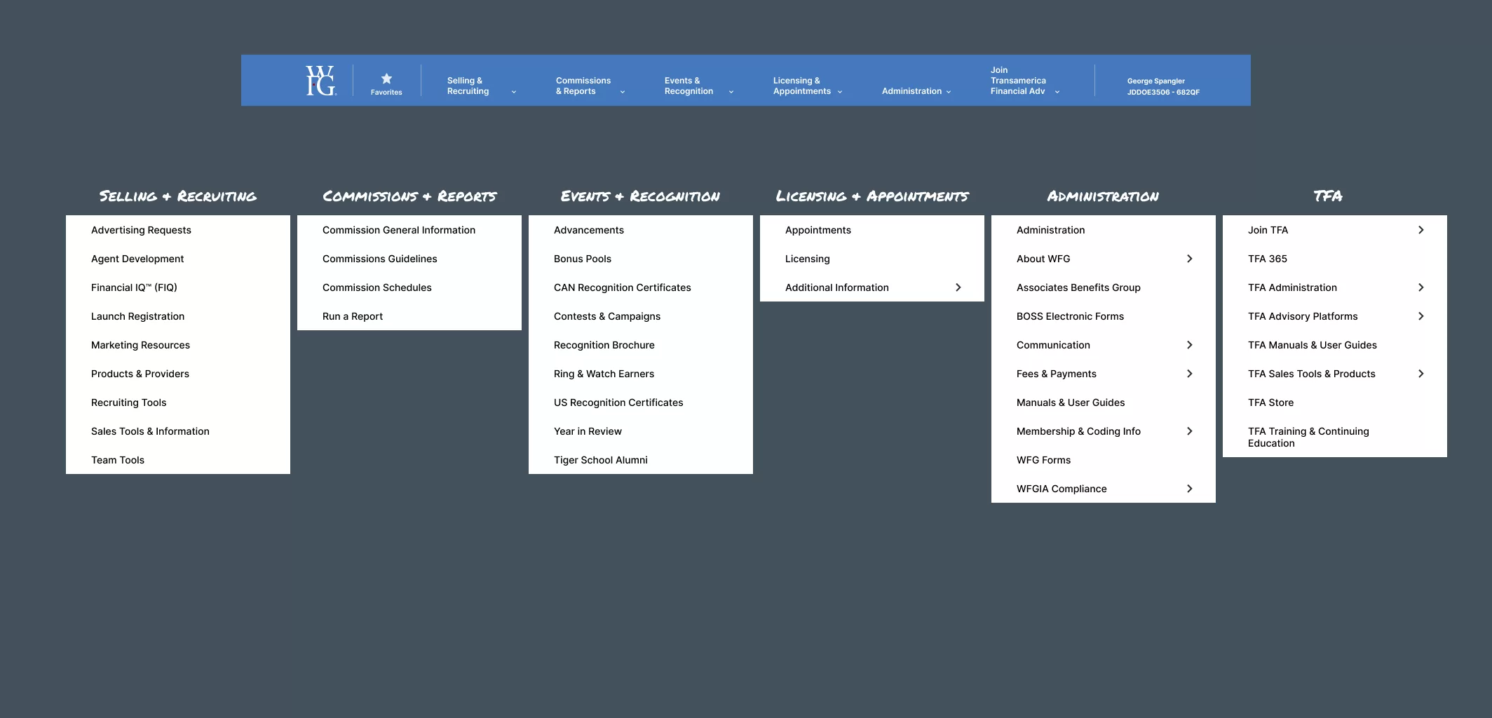
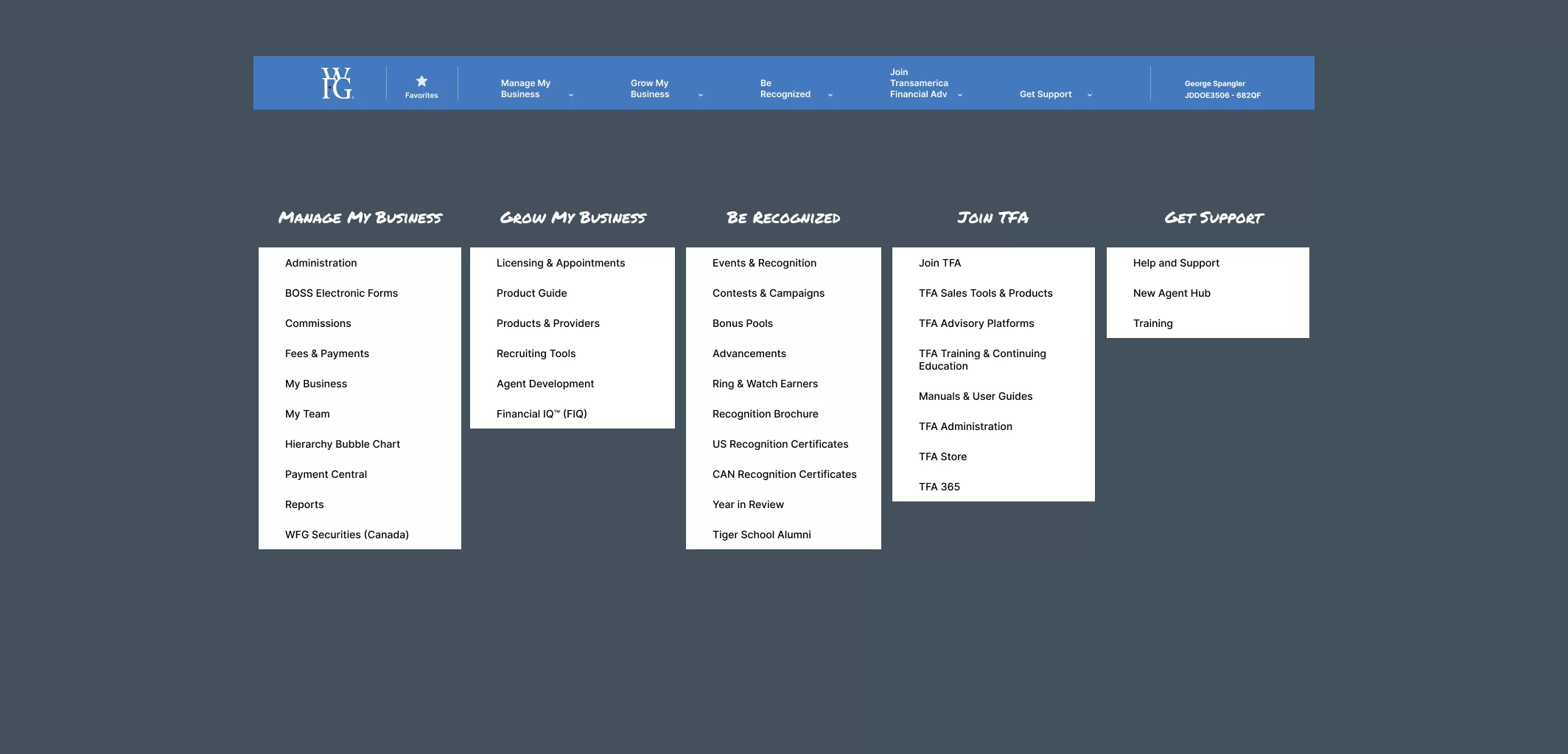
- Why it mattered: The two concepts split opinion in a way that wouldn’t have shown up without direct feedback. One agent said a concept felt “more aligned to how people see the business,” while another pushed back simply because it was different from what they already knew — “people will have negative reaction to change.”
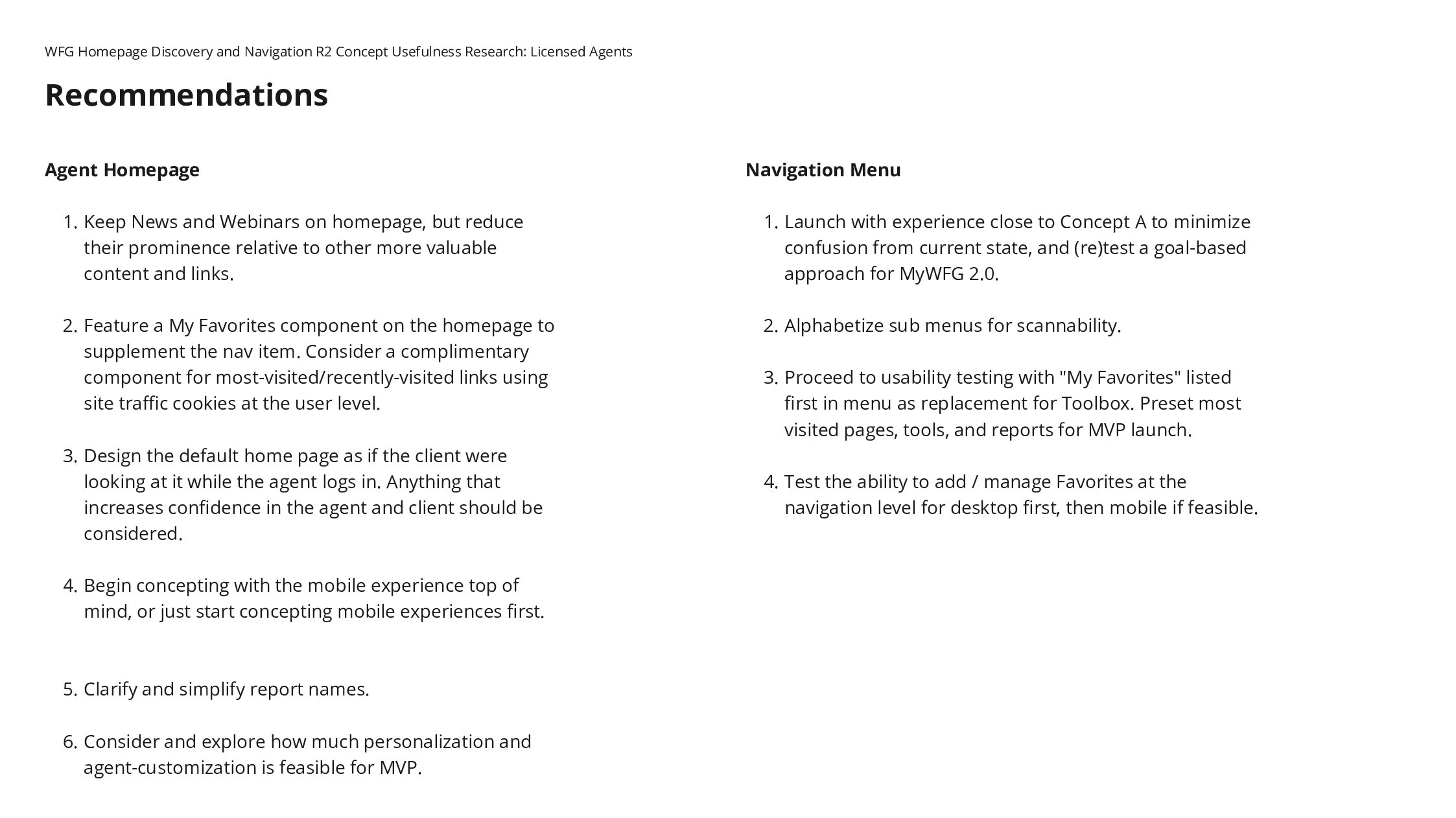
- The actual decision: Between a structurally better concept that some agents resisted purely on familiarity grounds, and a more conservative option that would have under-delivered on the original problem. I went with the structural change, betting that resistance from familiarity would fade once agents adapted — which the early post-launch feedback has started to support, though it’s not yet fully validated.
Process
The project began with user research, where we conducted interviews and surveys with WFG agents to identify their pain points and gather insights on how the current navigation was impacting their workflow. Based on these insights, we set research-backed goals and proceeded with design and prototyping, developing several design concepts focused on simplifying navigation and improving mobile accessibility.
Next, we conducted usability testing with agents to evaluate the prototypes. This iterative process allowed us to refine the designs based on real-world feedback, making adjustments to enhance both desktop and mobile usability. After finalizing the design, we moved into implementation, closely monitoring user feedback to refine the system further before full rollout.
Quotes from the Research
“I feel this is friendlier. This one would be easier to teach my recruits.”
“This one is better than Concept A...better because it's more aligned to how people see the business. I just want to see how to manage / grow my business. It's more conducive to what I'm trying to do.”
"I like the other one better. People will have negative reaction to change."
Learning Valuable Insights
The clearest signal wasn’t “simplify navigation” — that part was expected. It was that a genuinely better design and a well-liked design aren’t always the same thing at first contact, and resistance to change has to be managed as part of the rollout, not treated as evidence the design was wrong. Mobile-first paid off as a hypothesis, but that’s still being confirmed against real usage data rather than proven.
Final Thoughts and Impact
This one’s still open. Full MVP testing and rollout data will tell us whether the bet on structural change over familiarity was the right one. If agent sentiment keeps trending positive as adoption grows, that’s the strongest evidence the harder call was correct — and if it doesn’t, that’s the next decision point.