The Problem
A feature faced negative feedback, but diagnosing root causes meant manually synthesizing help docs, demo transcripts, and scattered customer complaints. I could have spent weeks reading through all of it by hand — instead I made the call to vibe-code a tool that automatically generates persona-based journey maps from help center content, then integrates Zendesk and Slack to map complaints directly to journey steps. The bet: if the tool was wrong, I’d lose a week building something useless. If it worked, I’d turn months of manual audit into days.
Why It Mattered
The feedback was clear but the root causes were opaque. You could read a support ticket saying “confusing,” but which specific steps were confusing? A demo transcript mentioned complexity, but where did users get lost? Without a way to systematically map complaints to journey stages, any fix was guesswork.
Worse: manually building journey maps from scattered docs and videos would take weeks. We needed to respond to negative feedback fast — shipping improvements, not studies.
My Role
I owned the full build solo: designed the tool, vibe-coded the generator, integrated it with Zendesk and Slack, ran the analysis, and authored the handoff report. My goal was to automate the synthesis problem — turn scattered docs and demos into actionable journey maps, then wire them to live customer data so friction wasn’t abstract, it was pinned to specific steps.
The Key Insights
Problem Statement:
“A feature faced heavy negative feedback, but diagnosing root causes meant manually synthesizing help docs, demo transcripts, support tickets, and Slack escalations — too much surface area to audit systematically. Friction evidence was scattered across formats and platforms with no way to connect complaints to specific steps in the user journey.”
Design Decisions
1. Auto-generate from existing content, not from scratch
- What I did: Built the generator to ingest help center docs and demo video transcripts, automatically extracting personas and journey flows. No manual mapping; let the content speak.
- Why it mattered: We already had authoritative docs and demos. Reusing them meant fast turnaround and high fidelity — the journey map was built from what the company actually shipped, not my interpretation.
- Tradeoff: Generator quality depends on source content quality. Garbage docs = garbage maps. But the docs were good, so this was a win.
2. Export in multiple formats for different audiences
- What I did: Journey maps rendered as interactive HTML (editable in browser), but also exportable as PNG (for Slack, quick sharing) and PDF (for formal reports). Same data, different surfaces.
- Why it mattered: Engineers want to click and edit (HTML). PMs want to share in Slack quickly (PNG). Leadership wants a formal artifact (PDF). One tool, multiple use cases.
- Tradeoff: Export logic overhead — repaid by adoption. A tool no one uses because the output format is wrong is worthless.
3. Integrate Zendesk and Slack to overlay live customer data
- What I did: The tool pulls support tickets from Zendesk and escalations from Slack, then maps them to specific journey steps. Friction isn’t abstract — it’s pinned to where it actually occurs in the flow.
- Why it mattered: A journey map is theoretical until you validate it against real complaints. Integration meant the tool surfaced the highest-signal friction automatically.
- Tradeoff: Integration complexity — but the payoff was precision. A complaint about “configuration step 3” could now be mapped directly to the exact UI that caused it.
4. Separate writing-fixable friction from engineering blockers upfront
- What I did: The tool classifies each friction point by ownership: writing can fix (terminology, clarity, helper text) vs. engineering-only (routing, validation, state logic). Two lists, two different action plans.
- Why it mattered: Prevents wasted effort. A writing pass can’t fix a broken API. An engineering sprint won’t clarify confusing copy. Separating them means both teams ship faster.
- Tradeoff: Requires judgment calls about what’s fixable. But making those calls in the tool meant the report was already filtered by ownership, not just by severity.
- What I killed: I considered building a confidence score per friction point, but cut it. A number that looked precise but wasn’t backed by real measurement would have been worse than no number — better to flag ambiguity honestly than fake certainty.
The Solution: Journey-Map Generator + Integrated Complaint Surfacing
The tool moved through three phases sequentially:
1. Generator Prototype (Week 1–2)
Built a simple version that ingested placeholder docs and video transcripts, auto-generating personas and journey flows in HTML. Proved the extraction and rendering logic worked before touching real content.
2. Live Generator with Export Options (Week 2–5)
Integrated real help center docs and demo video transcripts. Added export functionality: interactive HTML (browser-editable), PNG (quick sharing), PDF (formal reports). Single source, multiple outputs.
3. Zendesk + Slack Integration (Week 5–8)
Wired the tool to pull support tickets from Zendesk and escalations from Slack. The generator now maps each complaint to the specific journey step where friction occurs. Result: every customer complaint is pinned to a step, automatically classified by owner (writing vs. engineering), and ready for action.
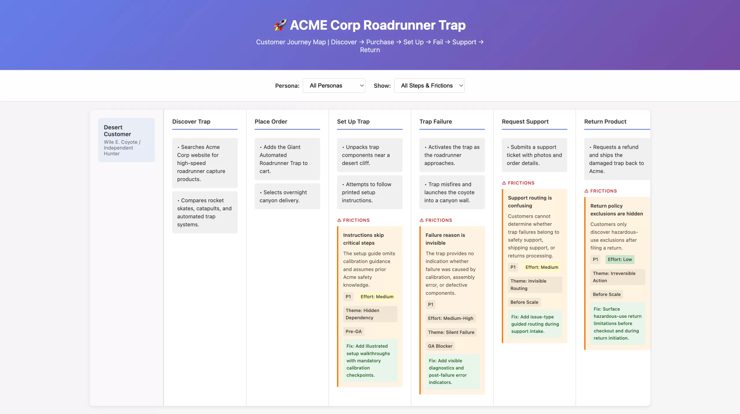
Proof of concept: A customer journey map generated from help docs and customer feedback, showing how scattered friction data (support tickets, user confusion, product failures) gets systematically pinned to specific workflow steps. Orange friction boxes surface problems at each stage with priority, effort, and recommended fixes—demonstrating the tool’s ability to turn fragmentary complaints into actionable, scoped work for both writing and engineering teams.
Outcome
Within the eight-week window, the work went from validated prototype to shipped tool to engineering handoff.
Writing-Side Fixes: Complete
Across all four admin sections:
- Jargon removed: confusing product terminology replaced with admin-centered language (6 terms total)
- Toggle copy converted to declarative statements with both ON/OFF states explained
- Helper text and progressive disclosure added for error prevention and conditional relevance
- Visual progress indicator and step descriptions built with state clarity
Engineering-Owned Issues: Scoped
As of the final report, the following are explicitly owner-assigned and tracked separately:
- Routing logic broken (notifications never reach designated recipients, multi-stage chains skip levels) — Owner: Engineering
- Silent auto-submit when no valid recipient exists — Owner: Engineering
- Irreversible state transitions (misclick requires full workflow reset) — Owner: Product + Engineering
- Multi-recipient / any-of-group support not shipped — Owner: Product
- Required-field validation not enforced at submit time — Owner: Engineering
Usability validation and baseline metrics: Defined in the report but not yet run. The report explicitly calls for moderated usability sessions and a post-launch support-ticket baseline to measure whether configuration-related inquiries drop.
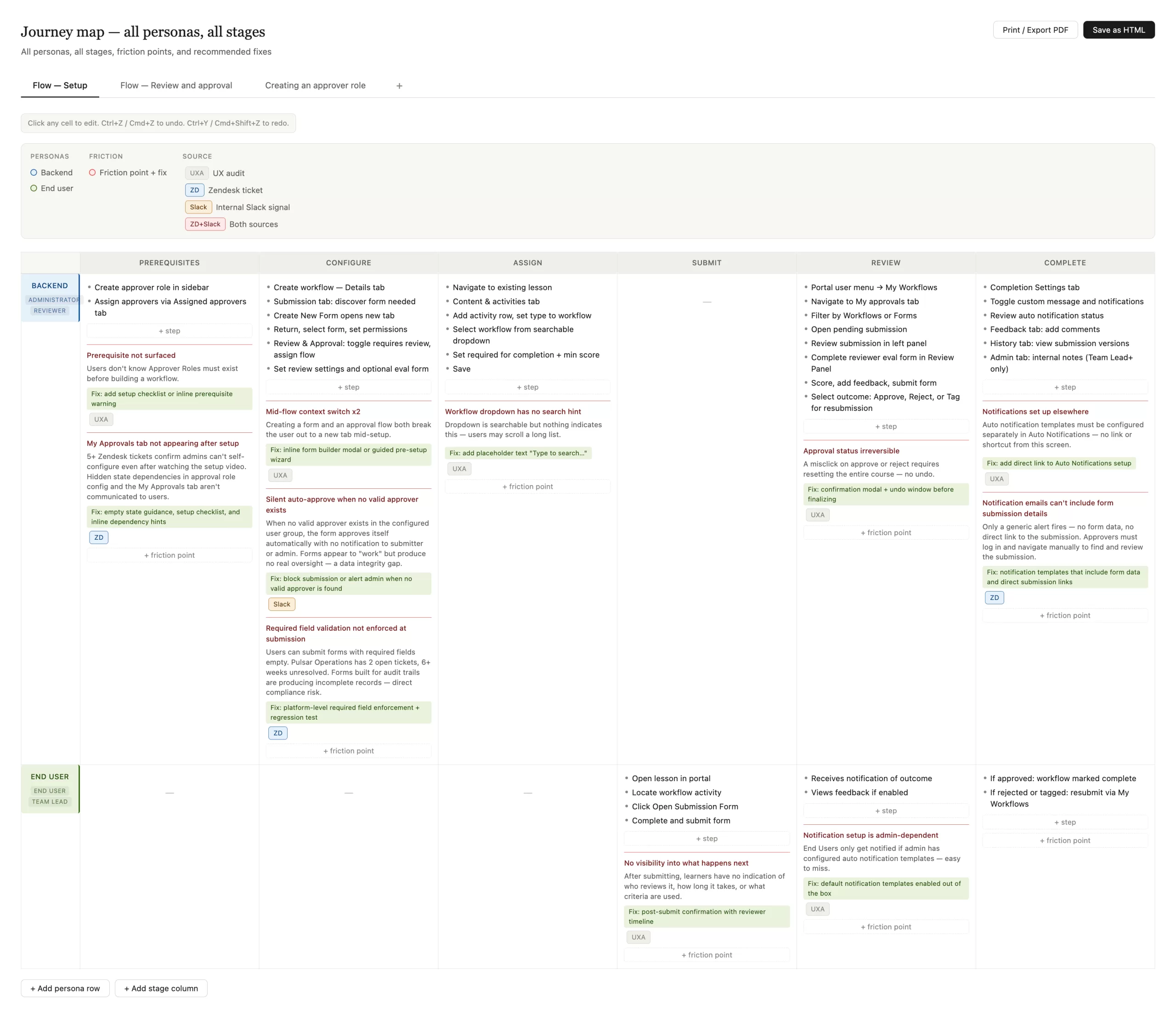
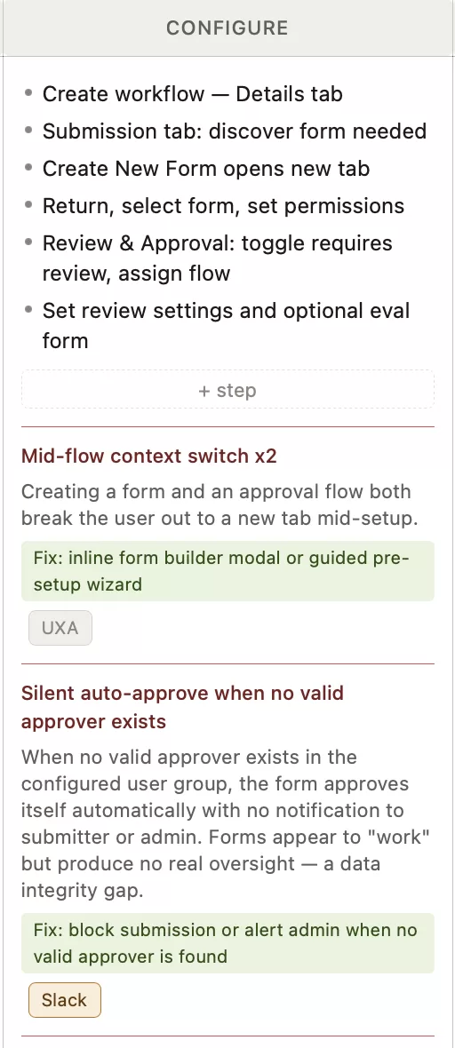
The journey-map generator in action: A fully populated journey map showing two personas (Backend Administrator, End User) across six workflow stages (Prerequisites, Configure, Assign, Submit, Review, Complete). Orange friction-point boxes surface problems at step-level precision—each with a description, priority tag (UXA = UX audit, ZD = Zendesk ticket, Slack = internal signal), effort estimate, and green-highlighted suggested fix. Multiple tabs at the top show different workflow variants (Flow — Setup, Flow — Review and approval, Creating an approver role). The map is fully editable, with buttons to add persona rows, stage columns, step items, and friction points. Print/Export PDF and Save as HTML buttons enable sharing with engineering and product teams.