Solution / Overview
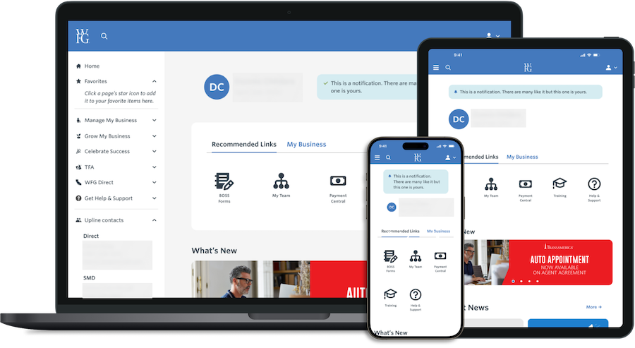
The WFG agent portal was the kind of tool everyone tolerated but nobody liked — cluttered, generic, and built without much regard for who was actually using it. The direction was already set before I joined, but the open question on the table was personalization: build one dashboard everyone uses the same way, or build role-based views that diverge for licensed agents versus senior agents managing teams. I argued for the latter, which meant more design and system complexity in exchange for relevance per role.
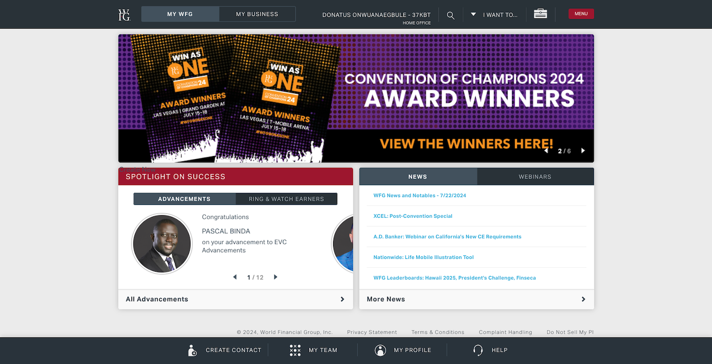
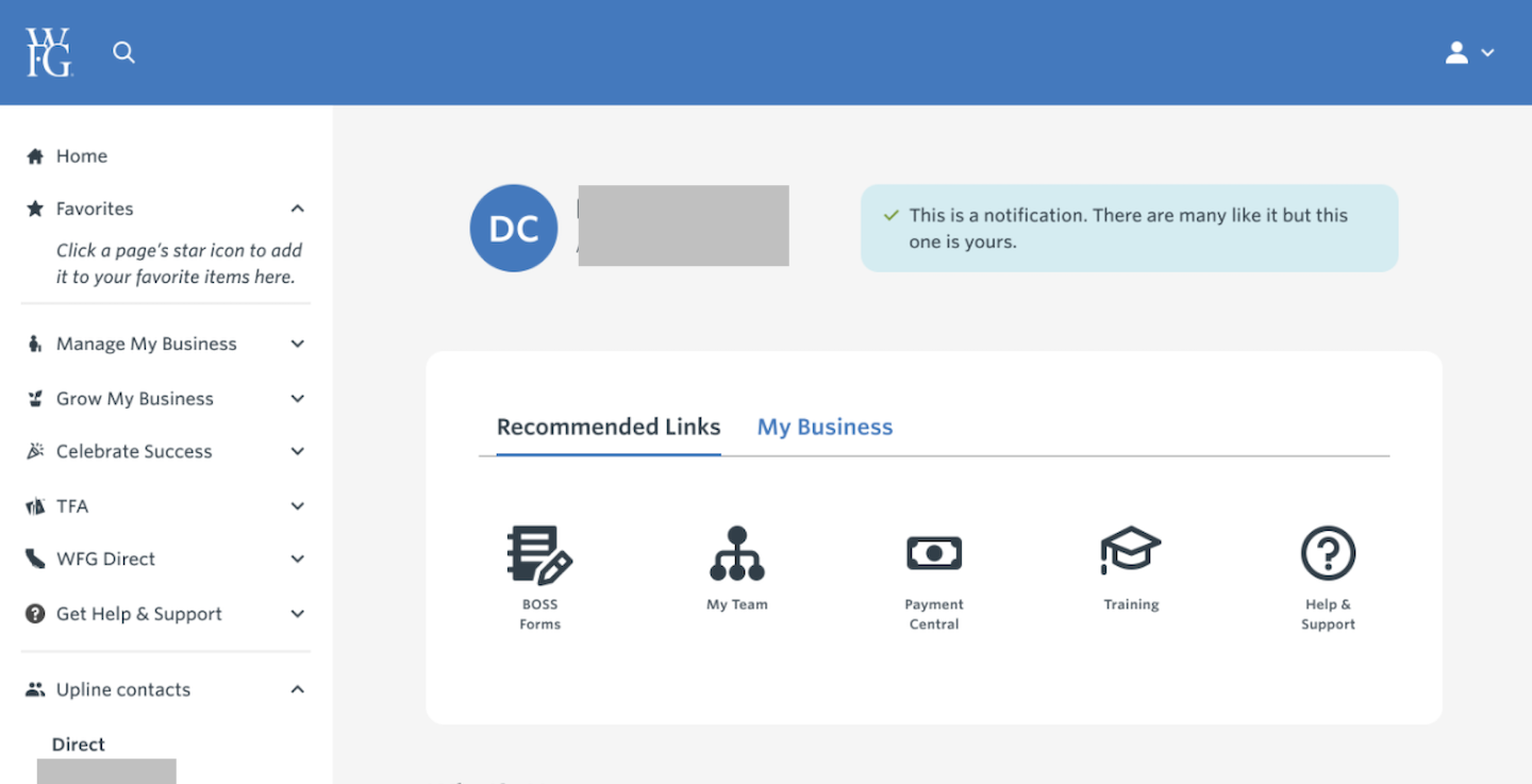
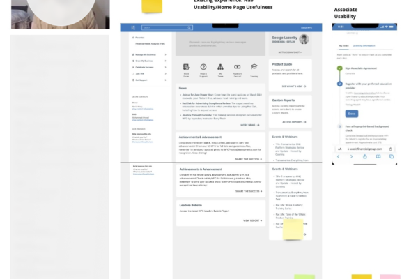
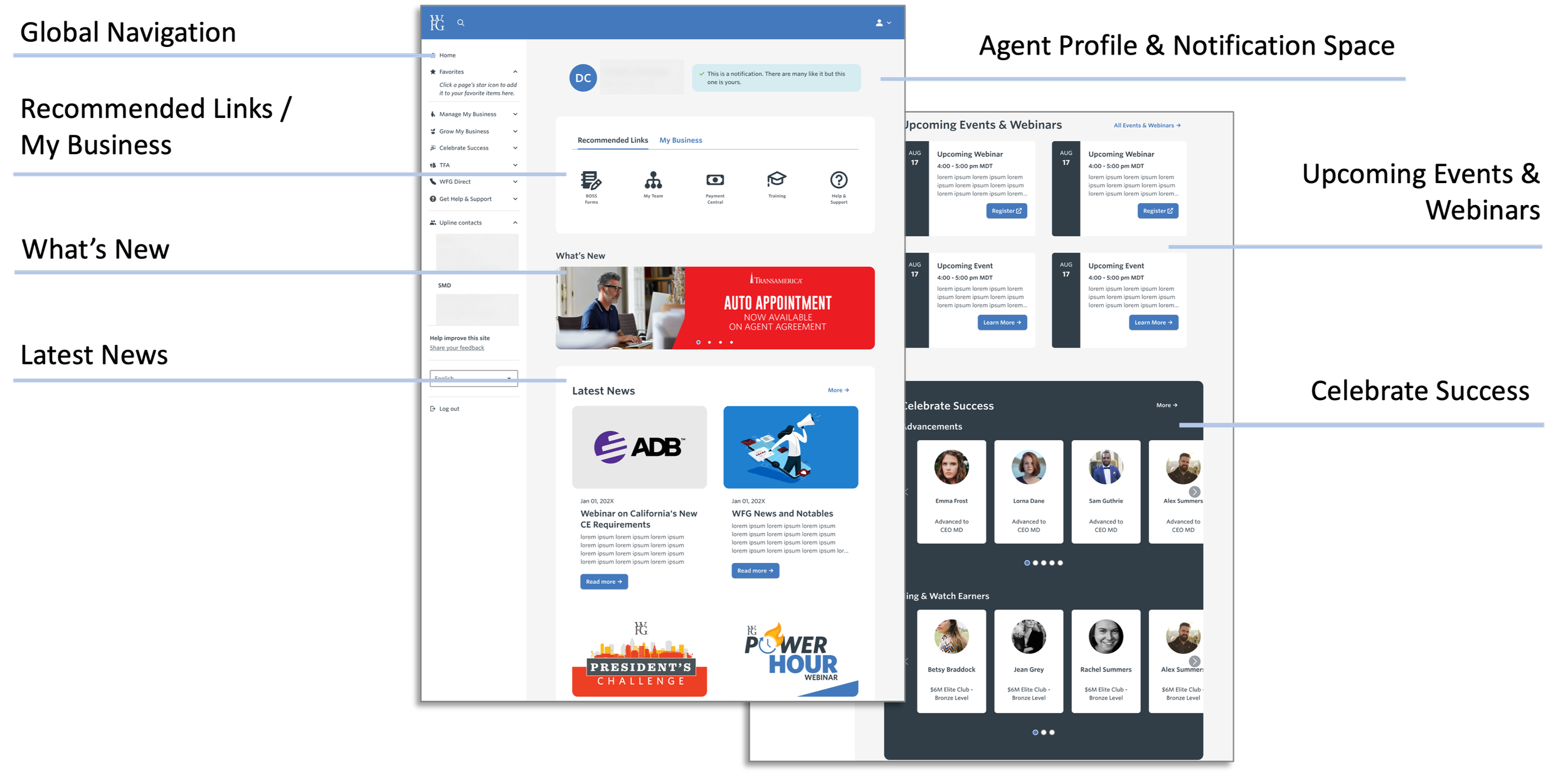
The previous design (left) was cluttered and made it difficult for advisors to access their most-used tools and information efficiently. The redesigned version (right) streamlines the experience, providing critical resources with minimal friction.
Key Features of the Solution:
- Interactive Dashboard: A redesigned homepage with a focus on accessibility, task prioritization, and role-based customization.
- Personalized Content: Sections that adapt to the user’s role—licensed agents gained quick access to sales tools, while senior agents could efficiently oversee team metrics.
- Streamlined Navigation: Improved layouts and tool placements made essential resources easy to find, reducing time spent searching and increasing productivity.
- Customized Design System: A unique design system tailored to WFG’s branding and functionality requirements ensured consistency and usability across the platform.
This comprehensive redesign reflected the unique needs of WFG’s agents while fostering productivity, user satisfaction, and engagement. By listening to users and iterating on feedback, the solution transformed frustration into empowerment, helping agents achieve their goals with ease and confidence in a SAFe Agile environment.
Collaborating on a Research-Driven Approach
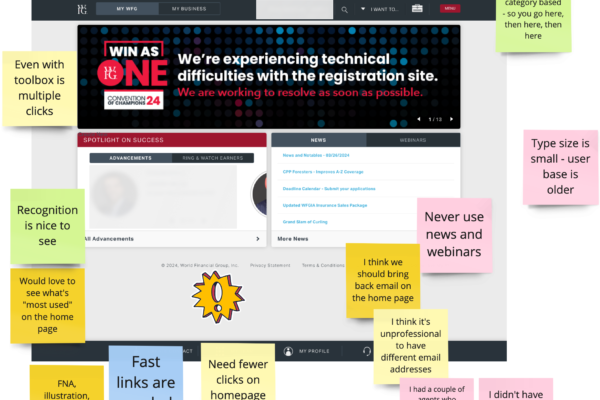
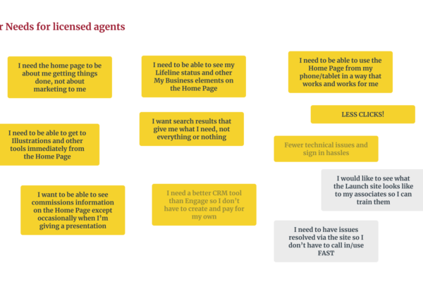
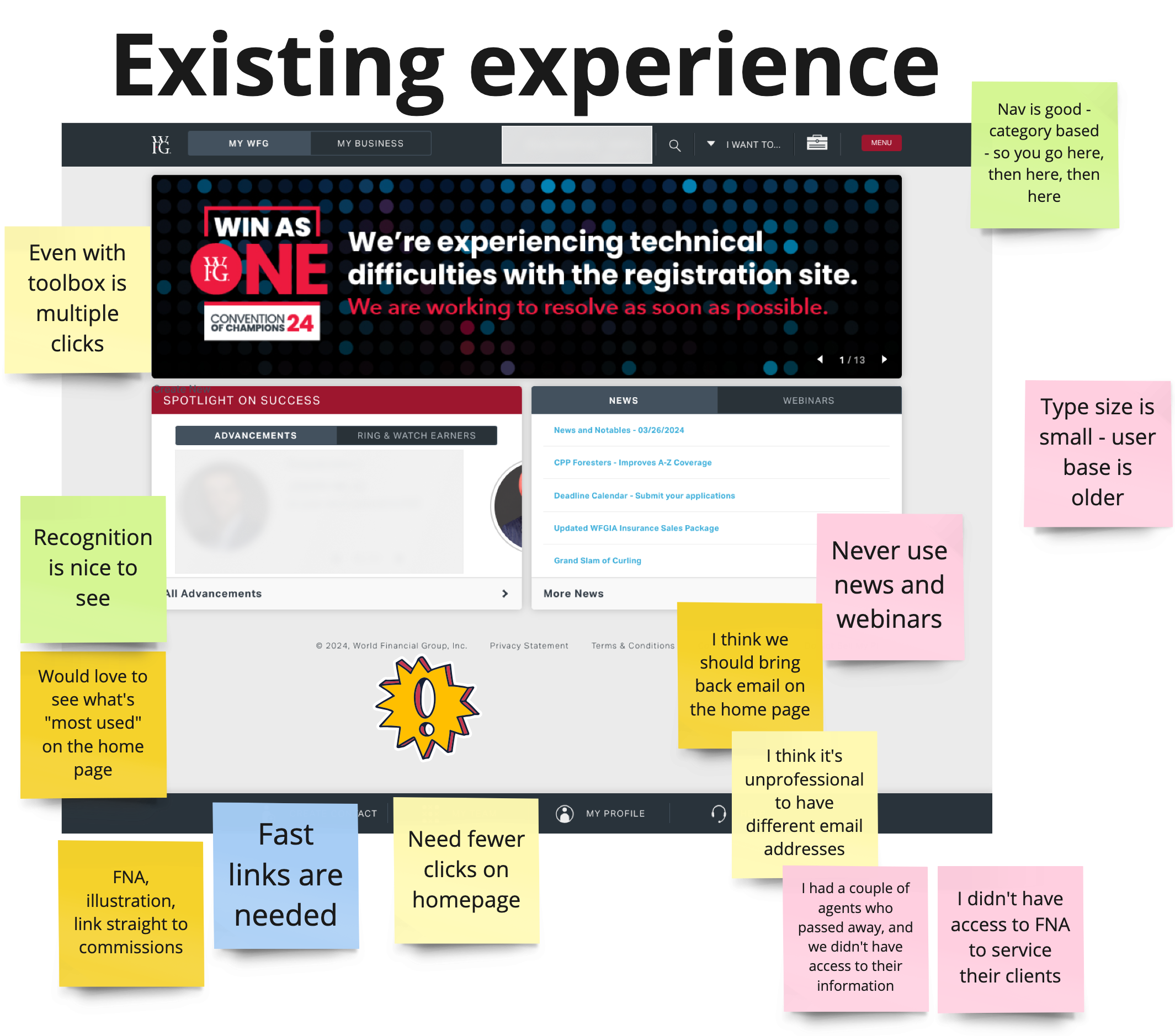
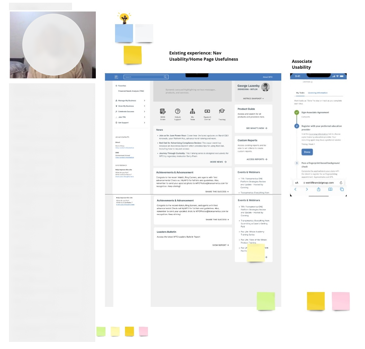
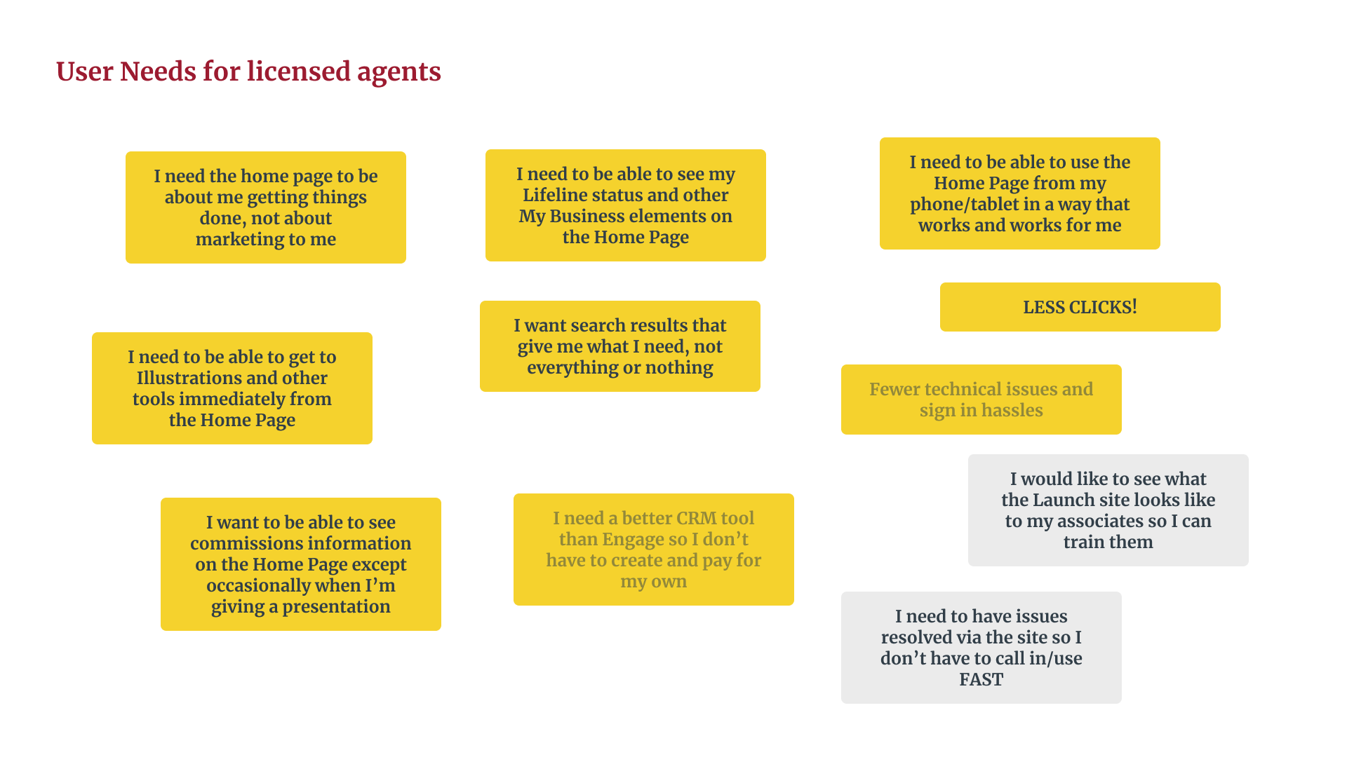
While the project’s direction was set before I joined, our team identified opportunities to conduct key research, including user interviews and usability tests, to refine the design. Working together, we ensured the final solution aligned with user needs, demonstrating my ability to contribute to impactful, user-centered design in a collaborative environment.
Based on insights gathered during research and testing, the following metrics were established as key indicators of the redesign’s potential success. These targets represent the outcomes expected to address the challenges identified during the project:
- Task Completion Rate: Aiming for a 95% task completion rate to ensure users can easily navigate the portal and complete key tasks with minimal friction.
- User Engagement: Setting a goal for a 20% increase in weekly logins, reflecting improved usability and user motivation to interact with the portal regularly.
- User Satisfaction: Targeting a 75% satisfaction rate, indicating a significant positive response to the tailored, intuitive design.
- Net Promoter Score (NPS): Aspiring to achieve an NPS of 40+, signifying users’ likelihood to recommend the portal to colleagues due to its effectiveness and personalization.
These metrics were not measured yet but were defined as aspirational goals, informed by user research, competitive analysis, and usability testing. They serve as benchmarks for the ongoing project and guide the iterative improvements to ensure the final solution delivers maximum value to users.
Problem
The WFG agent portal was unintuitive and inefficient, with essential tools hard to find and no personalization, leading to frustration, reduced productivity, and low engagement.
3 Key Decisions
-
- What I did: Joined a project whose direction was already set, and pushed to add user interviews and usability testing rather than design against the existing brief alone.
- Why it mattered: The original scope didn’t include direct user input — adding it meant the redesign was grounded in actual agent pain points instead of assumptions carried over from the prior portal.
- Tradeoff: Adding research after direction was set cost time the team didn’t originally budget for, but skipping it risked shipping a redesign that solved the wrong friction.
- Develop a Tailored Design System: Created a consistent, scalable system aligned with WFG’s needs.
- What I did: Built a custom design system for WFG instead of reusing a generic or off-the-shelf component set.
- Why it mattered: WFG’s branding and functional requirements didn’t map cleanly onto existing patterns, so a tailored system kept the experience consistent without forcing the design into a mismatched mold.
- Tradeoff: A custom system takes longer to build and maintain than adopting an existing one — that cost was accepted because consistency across a high-friction tool mattered more than speed to ship.
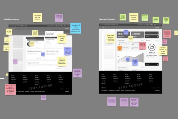
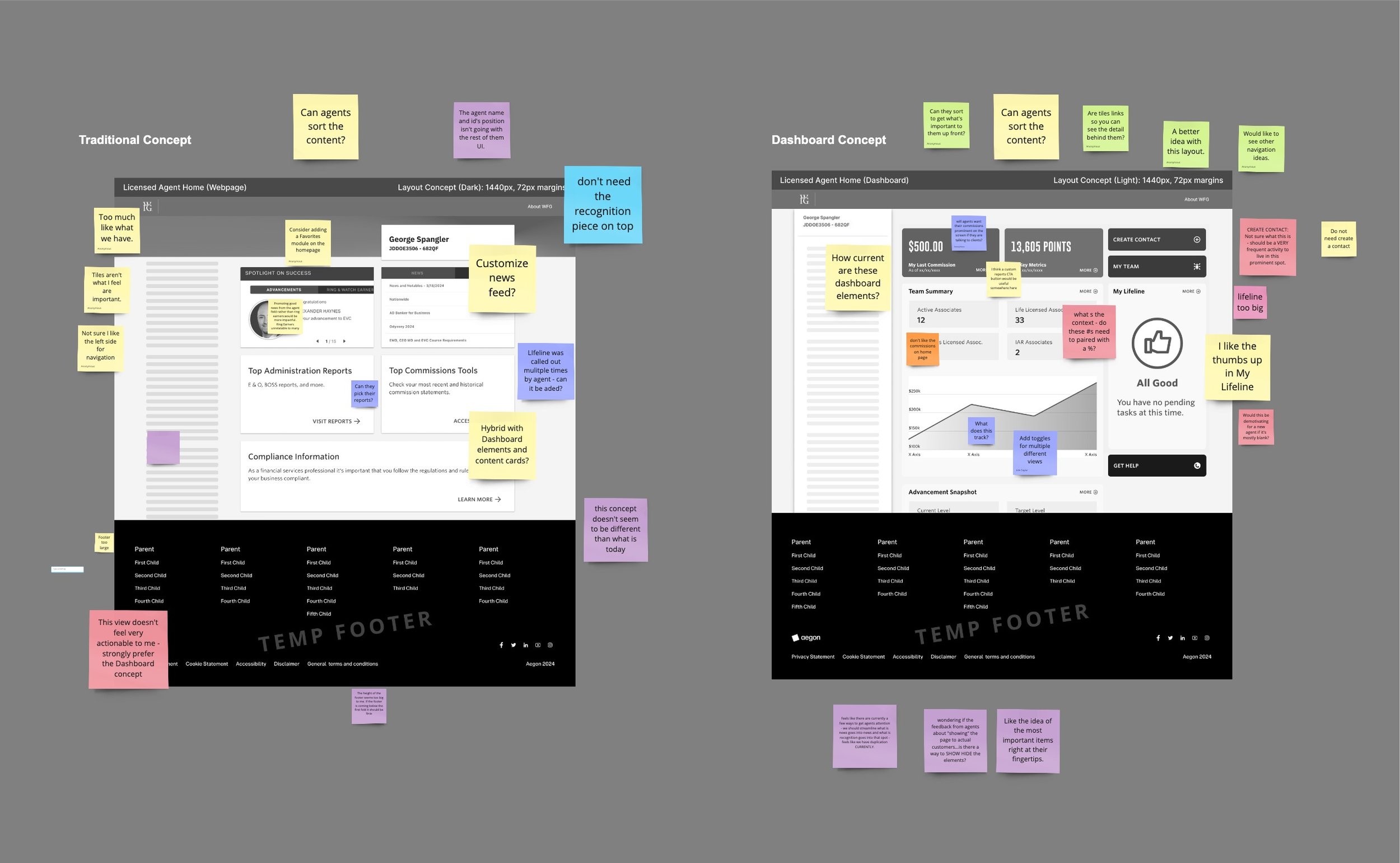
- Prioritize Personalization: Designed role-based dashboards for better task prioritization and ease of access.
- What I did: Designed role-based dashboards so licensed agents and senior agents saw different priority content, rather than one dashboard for everyone.
- Why it mattered: Licensed agents needed fast access to sales tools; senior agents needed team-metric visibility. A single shared view would have buried one group’s priorities to surface the other’s.
- Tradeoff: Role-based design multiplies the surface area you have to build, test, and maintain. It’s a bet that relevance per role outweighs the simplicity of one unified experience — a bet that hasn’t been validated yet, since engagement and satisfaction metrics are aspirational targets, not measured results.
Process
- Research: Gathered insights from user interviews, surveys, and usability tests.
- Prototyping: Created and tested wireframes and high-fidelity prototypes.
- Iteration: Refined designs based on feedback to improve usability and functionality.
- Customization: Built an ad-hoc, unique design system to ensure consistency and scalability.


Learnings
The real tension on this project wasn’t whether to do user research — that part was straightforward once added. It was whether personalization was worth the system complexity it demanded. Committing to role-based dashboards before having usage data to back it up was the riskier call, and it’s still an open question whether it pays off against a simpler shared-view alternative.
Final Thoughts
The targets — task completion, login frequency, NPS — are goals the team set going in, not results yet realized. I’d treat that honestly here: the personalization bet is the thing worth watching once real usage data comes in, since that’s the call most likely to be wrong in either direction.